LongPressButton
The LongPressButton is an interactive component in our library that triggers actions when pressed and held for a certain duration, typically longer than a standard button press.
Usage
Basic usage
import {LongPressButton} from 'rn-inkpad';
const MyComponent = () => {
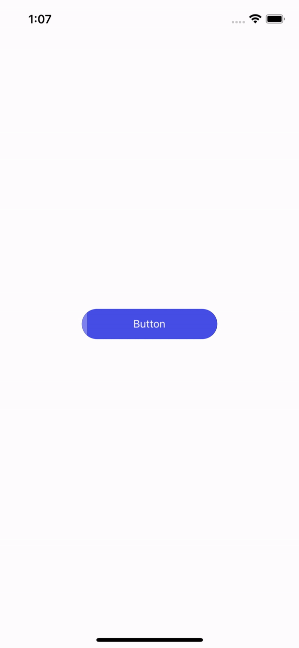
return <LongPressButton />;
};
Props
| Name | Type | Default | Description |
|---|---|---|---|
| backgroundColor | string | #464EE5 | Button background color. |
| behavior | 'left-to-right' | 'right-to-left' | 'center-to-ends' | left-to-right | Direction of movement of the bar. |
| borderRadius | number | 20 | Border radius. |
| fontSize | number | Font size. | |
| fullWidth | boolean | Active full width. | |
| height | DimensionValue | 40 | Button height. |
| icon | string | Button icon. | |
| iconPosition | 'left' | 'right' | left | Icon position. |
| longPressTime | number | 2000 | Time in ms of long press to execute the function. |
| progressColor | string | rgba(255, 255, 255, 0.3) | Indicator bar color. |
| style | StyleProp<ViewStyle> | Personalized styles for your button. | |
| text | string | Button | Button text. |
| textColor | string | #FFFFFF | Text color. |
| width | DimensionValue | 50% | Button width. |
| onFinish | () => void | Function that is executed at the end of the long press. |
Usage with props
import React, {useState} from 'react';
import {View, StyleSheet} from 'react-native';
import {LongPressButton} from 'rn-inkpad';
const MyComponent = () => {
const [isExecuted, setIsExecuted] = useState(false);
const handlePress = () => {
setIsExecuted(true);
setTimeout(() => {
setIsExecuted(false);
}, 1500);
};
return (
<View style={styles.container}>
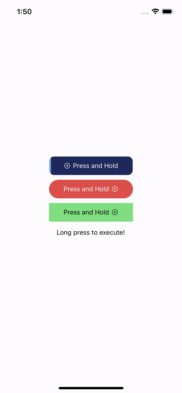
<LongPressButton
backgroundColor="#21295C"
borderRadius={10}
icon="add-circle-outline"
progressColor="#60a5fa"
text="Press and Hold"
onFinish={handlePress}
/>
<LongPressButton
backgroundColor="#DB504A"
behavior="center-to-ends"
icon="add-circle-outline"
iconPosition="right"
progressColor="rgba(0,0,0,0.5)"
style={{marginTop: 10}}
text="Press and Hold"
onFinish={handlePress}
/>
<LongPressButton
backgroundColor="#7EE081"
behavior="right-to-left"
borderRadius={0}
icon="add-circle-outline"
iconPosition="right"
progressColor="#C3F3C0"
style={{marginTop: 10}}
text="Press and Hold"
textColor="#000"
onFinish={handlePress}
/>
<Text style={{marginTop: 15}}>
{isExecuted ? 'Executed' : 'Long press to execute!'}
</Text>
</View>
);
};
const styles = StyleSheet.create({
container: {
alignItems: 'center',
flex: 1,
justifyContent: 'center',
},
});
Example with props