FloatingActionButton
The FloatingActionButton is a prominent and dynamic component within our library, designed to draw attention to a primary action within an application. It typically appears as a circular button that "floats" above the content, providing easy access to important functionalities or frequently used actions.
Usage
Basic usage
import React from 'react';
import {View, StyleSheet} from 'react-native';
import {CircleAvatar, FloatingActionButton} from 'rn-inkpad';
import Avatar from './assets/james_hetfield.jpeg';
const MyComponent = () => {
return (
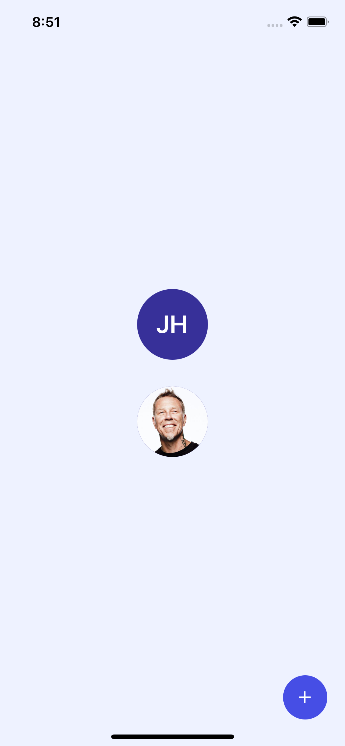
<View style={styles.container}>
<CircleAvatar size={80} defaultText="JH" />
<CircleAvatar size={80} image={Avatar} />
<FloatingActionButton />
</View>
);
};
const styles = StyleSheet.create({
container: {
alignItems: 'center',
flex: 1,
justifyContent: 'center',
},
});
Props
| Name | Type | Default | Description |
|---|---|---|---|
| actions | Action[] | Action buttons that appear when you press the FAB. | |
| align | 'top-left' | 'top-right' | 'bottom-left' | 'bottom-right' | bottom-right | Button position on the screen. |
| backgroundColor | string | #464EE5 | FAB background color. |
| marginHorizontal | number | 20 | Separation from horizontal edge to button. |
| marginVertical | number | 30 | Separation from vertical edge to button. |
| icon | string | add | Button icon. |
| iconColor | string | #FFFFFF | Icon color. |
| iconSize | number | 22 | Icon size. |
| size | number | 50 | Button size |
| onPress | () => void | Function that is executed when the button is pressed. |
Information
If you send onPress and actions, onPress has higher importance, consequently, only the onPress function will be executed.
Action props
| Name | Type | Required | Description |
|---|---|---|---|
| icon | string | YES | Action button icon. |
| text | string | NO | Information text |
| onPress | () => void | YES | Function that is executed when the button is pressed. |
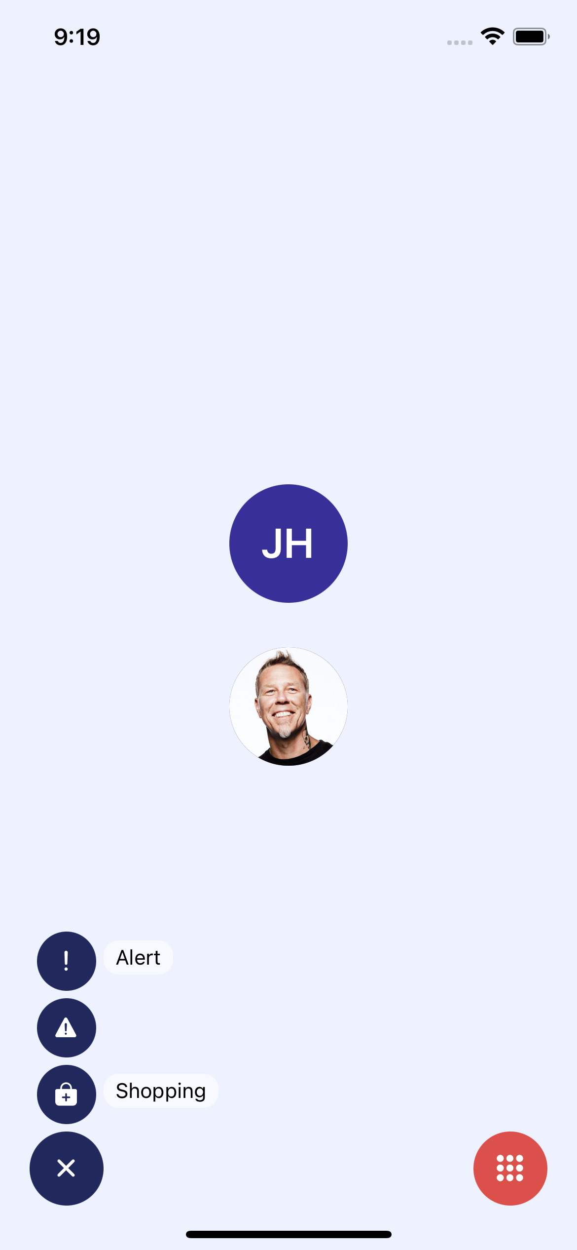
Usage with props
import React from 'react';
import {View, StyleSheet} from 'react-native';

import {CircleAvatar, FloatingActionButton} from 'rn-inkpad';

import Avatar from './assets/james_hetfield.jpeg';

const MyComponent = () => {
  return (
    <View style={styles.container}>
      <CircleAvatar size={80} defaultText="JH" />
      <CircleAvatar size={80} image={Avatar} />

      <FloatingActionButton
        icon="apps"
        backgroundColor="#DB504A"
        onPress={() => console.log('Hola mundo')}
      />
      <FloatingActionButton
        align="bottom-left"
        backgroundColor="#21295C"
        actions={[
          {
            icon: 'alert',
            text: 'Alert',
            onPress: () => console.log('Alert'),
          },
          {
            icon: 'warning',
            onPress: () => console.log('Warning'),
          },
          {
            icon: 'bag-add',
            text: 'Shopping',
            onPress: () => console.log('Shopping'),
          },
        ]}
      />
    </View>
  );
};

const styles = StyleSheet.create({
  container: {
    alignItems: 'center',
    flex: 1,
    justifyContent: 'center',
  },
});
Example with props