Button
The Button component in our library is a fundamental element for user interaction within applications. Buttons serve as clickable elements that trigger actions or navigate users through different parts of the application. They are versatile and can be styled to match the visual theme of the application, providing consistency in user interface design. With customizable properties such as size, color, and shape, our Button component offers flexibility to suit various design requirements and enhance user experience.
Usage
Basic usage
import React from 'react';
import {Button} from 'rn-inkpad';

const MyComponent = () => {
  return <Button />;
};

Props
| Name | Type | Default | Description |
|---|---|---|---|
| activeOpacity | number | 0.6 | Determines what the opacity of the wrapped view should be when touch is active. |
| buttonColor | string | #464EE5 | Button background color. |
| buttonType | 'solid' | 'outline' | 'clear' | solid | Type of button to show. |
| color | string | #FFFFFF | Text color. |
| disabled | boolean | Turn pressable on or off. | |
| full | boolean | Active full width. | |
| icon | string | Icon to show in the button. | |
| iconPosition | 'left' | 'right' | left | Choose the position in which the icon appears. |
| iconSize | number | Icon size | |
| loading | boolean | Show a spinner if the button is loading. | |
| rounded | boolean | Round borders | |
| spinnerSize | number | 'small' | 'large' | Loading spinner size. | |
| style | StyleProp<ViewStyle> | Personalized styles for your button. | |
| text | string | Button | Button text |
| textStyle | StyleProp<TextStyle> | Personalized styles for your text button. | |
| onPress | () => void | Function that is executed when the button is pressed. |
Usage with props
import React from 'react';
import {View} from 'react-native';
import {Button} from 'rn-inkpad';
const MyComponent = () => {
return (
<View>
<Button
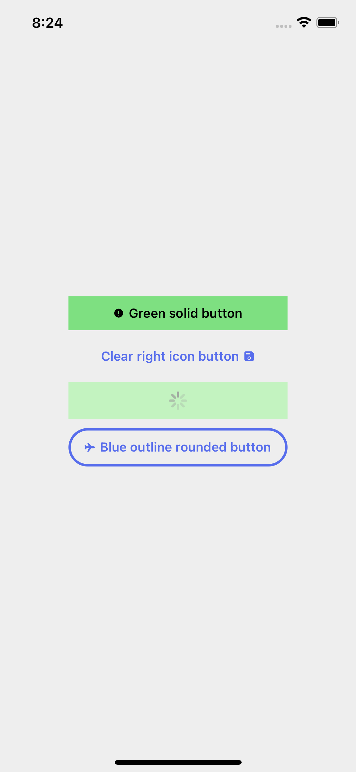
text="Green solid button"
icon="alert-circle"
color="#000"
onPress={() => console.log('Press')}
buttonColor="#7EE081"
style={{marginBottom: 10}}
/>
<Button
text="Clear right icon button"
icon="save"
onPress={() => console.log('Press')}
buttonType="clear"
iconPosition="right"
color="#576DEC"
style={{marginBottom: 10}}
/>
<Button
text="Loading button..."
loading
onPress={() => console.log('Press')}
buttonColor="#C3F3C0"
style={{marginBottom: 10}}
/>
<Button
text="Blue outline rounded button"
icon="airplane"
onPress={() => console.log('Press')}
buttonType="outline"
buttonColor="#576DEC"
rounded
/>
</View>
);
};
Example with props