Slider
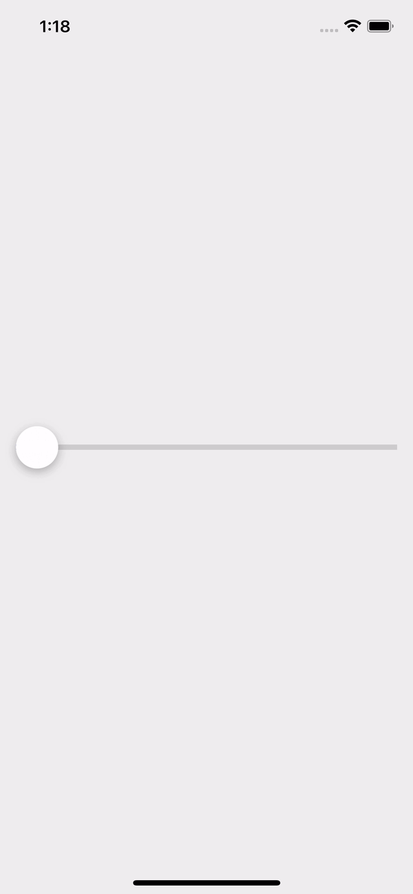
The Slider component in our library is a user interface element used to enable users to select a value from a continuous range. It typically appears as a horizontal bar with a draggable thumb that users can slide along the bar to adjust the value. Sliders are commonly used in applications for settings such as volume control, brightness adjustment, or selecting a price range.
Usage
Basic usage
import {Slider} from 'rn-inkpad';

const MyComponent = () => {
  return <Slider />;
};
Props
| Name | Type | Default | Description |
|---|---|---|---|
| maxValue | number | 100 | Maximum value the slider can reach. |
| minValue | number | 0 | Minimum value of the slider. |
| thumbStyles | ThumbStyles | ThumbStyles default | Thumb custom styles. |
| trackStyles | TrackStyles | TrackStyles default | Track custom styles. |
| value | number | 0 | Slider current value. |
| onChange | (value: number) => void | Function that is executed when moving the slider and returns the current value of the slider. |
ThumbStyles props
| Name | Type | Default | Description |
|---|---|---|---|
| backgroundColor | string | #FFFFFF | Thumb background color. |
| borderRadius | number | 50 | Thumb border radius. |
| height | number | 40 | Thumb height. |
| icon | string | Thumb icon. | |
| iconColor | string | #4D67FF | Thumb icon color. |
| iconSize | number | 20 | Thumb icon size. |
| shadow | boolean | true | Show or hide the shadow on the thumb. |
| width | number | 40 | Thumb width. |
TrackStyles props
| Name | Type | Default | Description |
|---|---|---|---|
| borderRadius | number | Track border radius. | |
| height | number | 5 | Track height. |
| trackColor | string | #CECECE | Track background color. |
| trackCompletedColor | string | #4D67FF | Completed track background color. |
Usage props
import React, {useState} from 'react';
import {StyleSheet, Text, View} from 'react-native';
import {Slider} from 'rn-inkpad';
const MyComponent = () => {
const [value, setValue] = useState(false);
return (
<View>
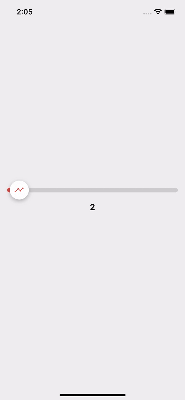
<Slider
thumbStyles={{
icon: 'analytics',
iconColor: '#DB504A',
}}
trackStyles={{
height: 10,
borderRadius: 5,
trackCompletedColor: '#DB504A',
}}
value={value}
onChange={setValue}
/>
<Text style={styles.text}>{value}</Text>
</View>
);
};
const styles = StyleSheet.create({
text: {
fontSize: 18,
fontWeight: '600',
marginTop: 20,
textAlign: 'center',
},
});
Example with props