Toast
The Toast component in our library is a lightweight and non-intrusive user interface element used to display brief messages or notifications to users. It typically appears as a small rectangular pop-up that appears at the top or bottom of the screen for a short period before disappearing automatically. Toasts are commonly used to provide users with quick feedback, alerts, or confirmation messages after completing an action, such as saving a file, submitting a form, or successfully completing a task.
Usage
Basic usage
import React, {useState} from 'react';
import {Button, Toast} from 'rn-inkpad';
const MyComponent = () => {
const [visible, setVisible] = useState(false);
return (
<View>
<Toast
visible={visible}
text="Toast information"
setVisible={setVisible}
/>
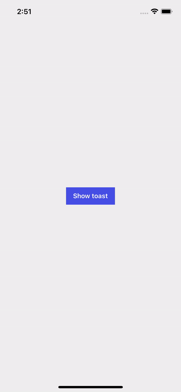
<Button text="Show toast" onPress={() => setVisible(true)} />
</View>
);
};
Props
| Name | Type | Required | Default | Description |
|---|---|---|---|---|
| text | string | YES | Toast text. | |
| visible | boolean | YES | Show or hide toast. | |
| backgroundColor | string | NO | rgba(0,0,0,0.7) | Toast background color. |
| bottom | number | NO | 30 | Separation between the bottom and the component when the position of the component is bottom. |
| duration | number | NO | 3000 | Time in milliseconds in which the toast will appear. |
| fontSize | number | NO | Toast text font size. | |
| icon | string | NO | Toast icon. | |
| position | 'bottom' | 'top' | NO | top | Determines where the toast will appear from. |
| textColor | string | NO | #FFFFFF | Toast text color. |
| textStyles | StyleProp<TextStyle> | NO | Custom text styles. | |
| top | number | NO | 50 | Separation between the top and the component when the position of the component is top. |
| setVisible | (visible: boolean) => void | YES | Function that controls the visibility of the toast. |
Usage props
import React, {useState} from 'react';
import {View} from 'react-native';
import {Buttom, Toast} from 'rn-inkpad';
const MyComponent = () => {
const [visibleTop, setVisibleTop] = useState(false);
const [visibleBottom, setVisibleBottom] = useState(false);
return (
<View>
<Toast
backgroundColor="#DB504A"
fontSize={16}
icon="information-circle-outline"
text="Toast top information"
visible={visibleTop}
setVisible={setVisibleTop}
/>
<Toast
backgroundColor="#21295C"
fontSize={16}
icon="cafe"
position="bottom"
text="Toast bottom information"
visible={visibleBottom}
setVisible={setVisibleBottom}
/>
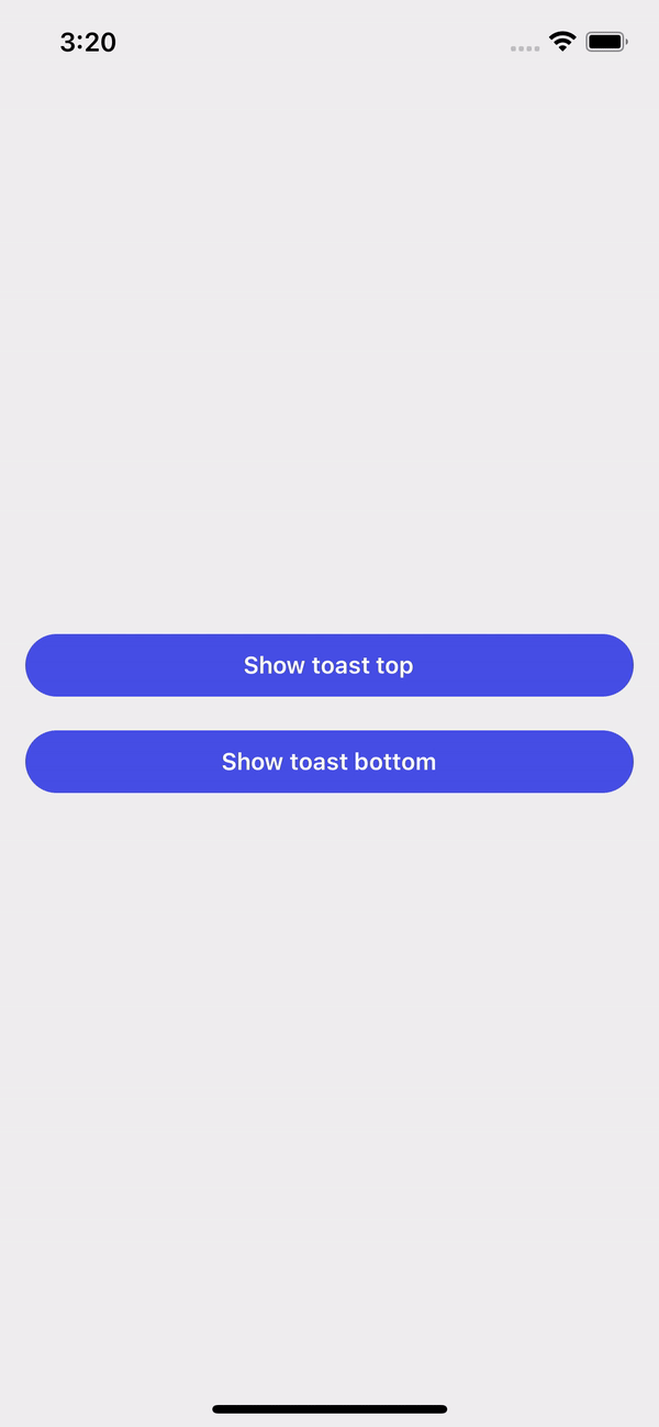
<Button
full
rounded
text="Show toast top"
onPress={() => setVisibleTop(true)}
/>
<Button
full
rounded
style={{marginTop: 20}}
text="Show toast bottom"
onPress={() => setVisibleBottom(true)}
/>
</View>
);
};
Example with props