Input
The Input component in our library is a fundamental element used for capturing user input within forms or interactive interfaces. It allows users to enter and submit various types of data, such as text or numbers.
Usage
Basic usage
import {Input} from 'rn-inkpad';

const MyComponent = () => {
  return <Input />;
};
Props
| Name | Type | Default | Description |
|---|---|---|---|
| autoComplete | autoComplete | Specifies autocomplete hints for the system, so it can provide autofill. | |
| borderColor | string | Border color. | |
| borderRadius | number | Set rounded corners. | |
| icon | string | Input icon. | |
| iconColor | string | Input icon color. | |
| iconSize | number | 15 | Input icon size. |
| keyboardType | KeyboardTypeOptions | Determines which keyboard to open, e.g.numeric. | |
| label | string | Input label. | |
| labelColor | string | Input label color. | |
| password | boolean | false | Password mode adds an icon to show or hide the password. |
| placeholder | string | Input | Input placeholder. |
| placeholderColor | string | Input placeholder color. | |
| rightIcon | string | Add an icon to the right, on said icon you can add a function. | |
| rightIconColor | string | Right icon color. | |
| rightIconSize | number | Right icon size. | |
| search | boolean | false | Activate search mode to add a search icon. |
| style | StyleProp<ViewStyle> | Custom styles for your input. | |
| textColor | string | Input value color. | |
| textContentType | textContentType | Give the keyboard and the system information about the expected semantic meaning for the content that users enter. | |
| textStyle | StyleProp<TextStyle> | Custom styles for your text input value. | |
| type | 'filled' | 'bordered' | 'outlined' | filled | Choose input style. |
| value | string | The value to show for the text input. TextInput is a controlled component, which means the native value will be forced to match this value prop if provided. | |
| onChangeText | (text: string) => void | Callback that is called when the text input's text changes. Changed text is passed as an argument to the callback handler. | |
| onEndEditing | () => void | Callback that is called when text input ends. | |
| onPress | () => void | Callback that is called when right icon is pressed. |
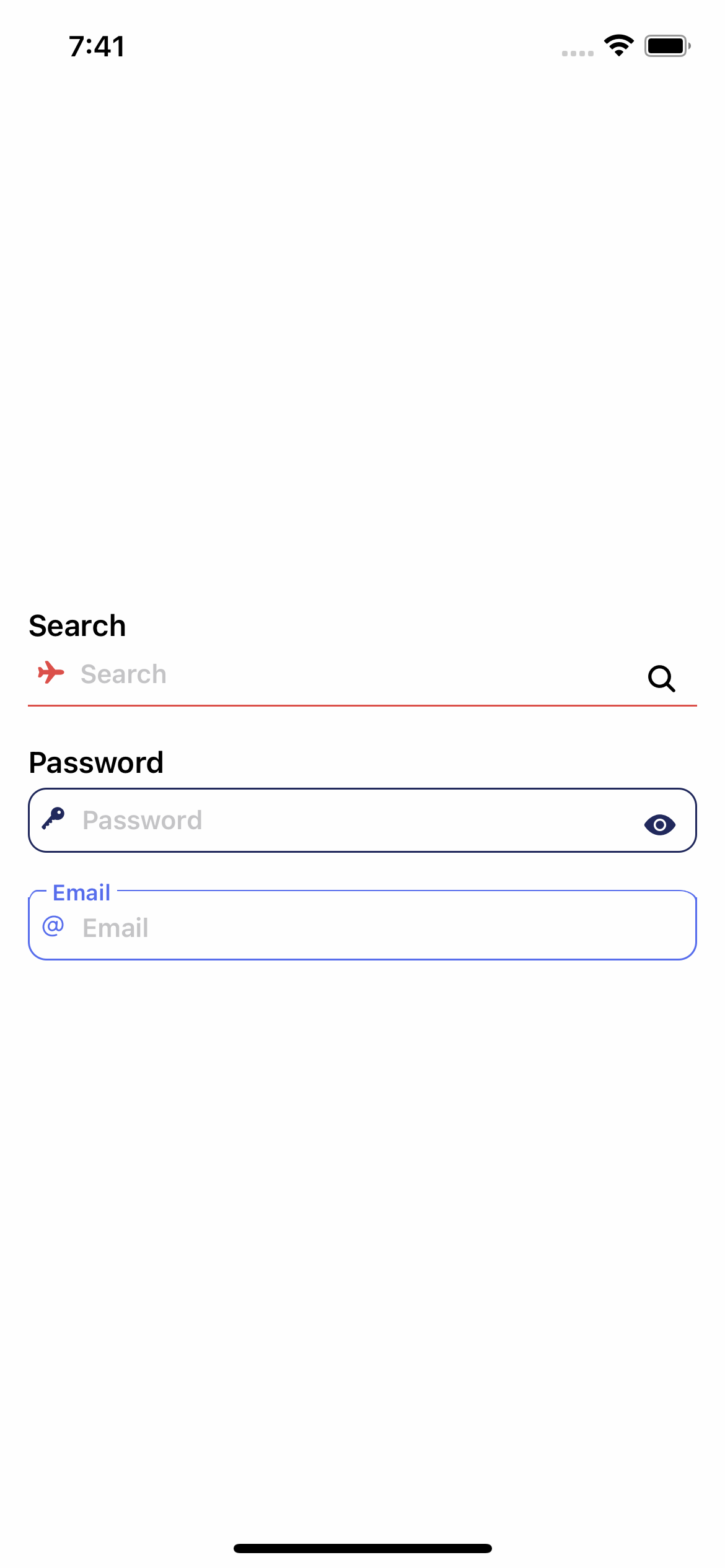
Usage with props
import {View} from 'react-native';

import {Input} from 'rn-inkpad';

const MyComponent = () => {
  return (
    <View>
      <Input
        borderColor="#DB504A"
        icon="airplane"
        iconColor="#DB504A"
        label="Search"
        search
      />
      <Input
        borderColor="#21295C"
        borderRadius={10}
        icon="key"
        iconColor="#21295C"
        label="Password"
        password
        rightIconColor="#21295C"
        type="bordered"
      />
      <Input
        borderColor="#576DEC"
        borderRadius={10}
        icon="at"
        iconColor="#576DEC"
        label="Email"
        labelColor="#576DEC"
        type="outlined"
      />
    </View>
  );
};
Example with props