Checkbox
The Checkbox component in our library is a user interface element used to enable users to select or deselect options. It typically appears as a small box that can be checked or unchecked, indicating the state of the option. Checkboxes are commonly used in forms, settings, or list items where users need to make multiple selections from a list of options.
Usage
Basic usage
import React from 'react';
import {CheckBox} from 'rn-inkpad';
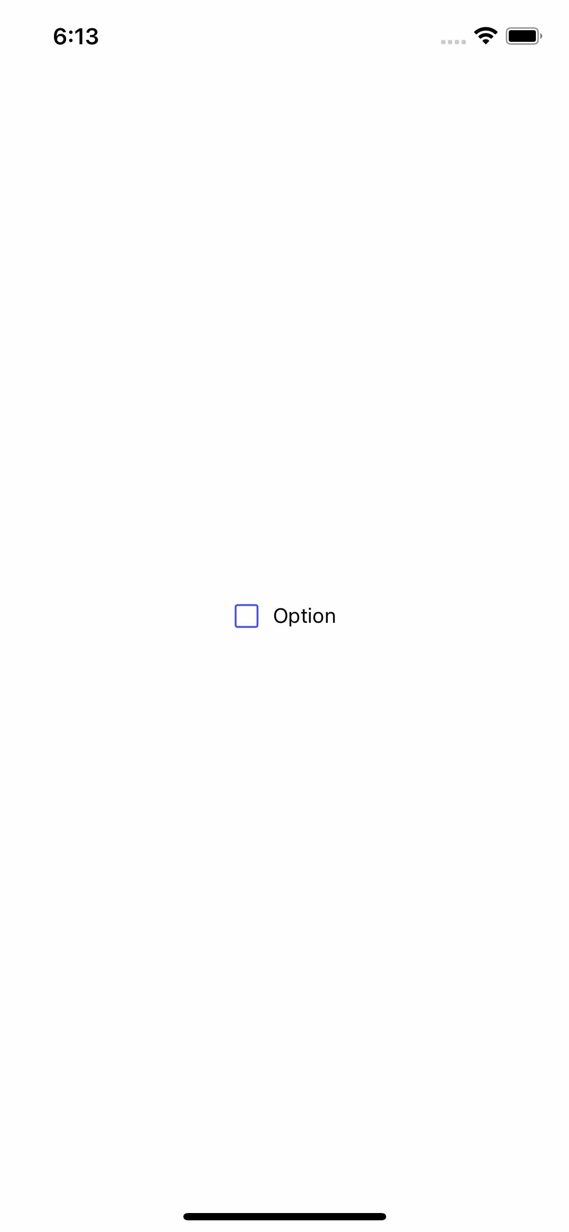
const MyComponent = () => {
return <CheckBox />;
};
Props
| Name | Type | Default | Description |
|---|---|---|---|
| checkedIcon | string | checkbox-outline | Icon when selected. |
| checked | boolean | false | Enable/disable selection. |
| iconColor | string | #464EE5 | Checkbox color. |
| iconSize | number | 20 | Checkbox size. |
| style | StyleProp<ViewStyle> | Personalized styles for your checkbox. | |
| textColor | string | Text color. | |
| textStyle | StyleProp<TextStyle> | Personalized styles for checkbox text. | |
| title | string | Item | Checkbox text. |
| unCheckedIcon | string | square-outline | Icon when unselected. |
| onChange | (value: boolean) => void | Function that captures the current value of the checkbox. |
Usage with props
import React, {useState} from 'react';
import {Text, View} from 'react-native';
import {CheckBox} from 'rn-inkpad';
const MyComponent = () => {
const [checked, setIsChecked] = useState(false);
return (
<View>
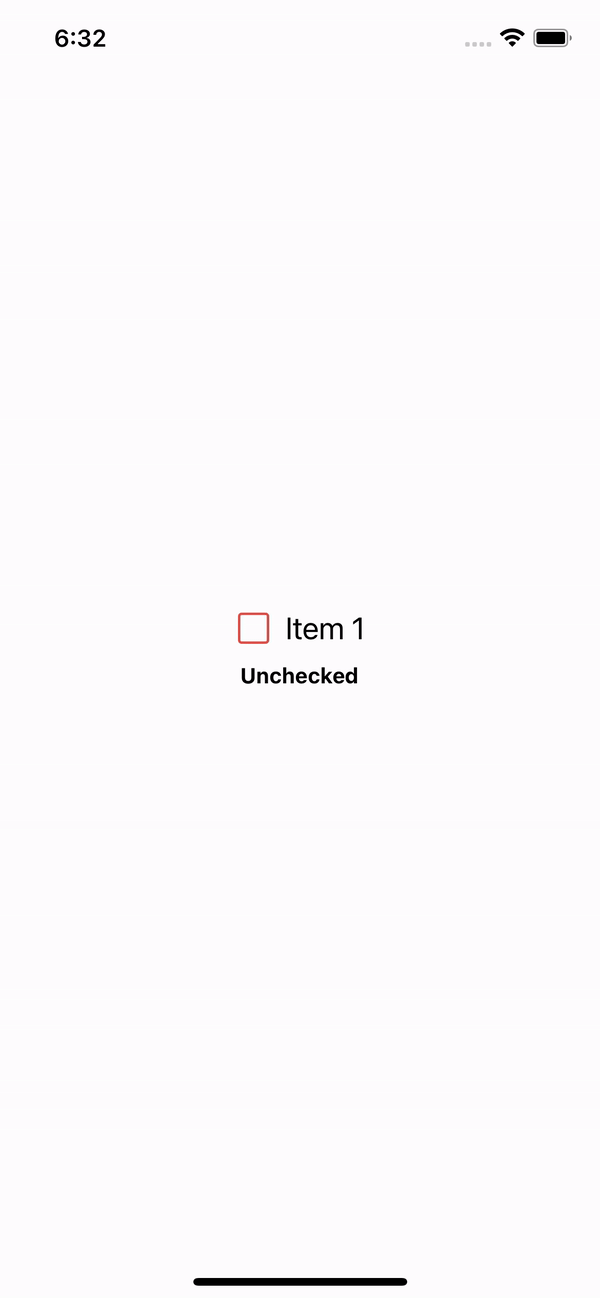
<CheckBox
checked={checked}
iconColor={'#DB504A'}
iconSize={25}
textStyle={{fontSize: 20}}
onChange={setIsChecked}
title={'Item 1'}
/>
<Text style={{marginTop: 10, fontWeight: '700'}}>
{checked ? 'Checked' : 'Unchecked'}
</Text>
</View>
);
};
Example with props