ActionSheet
An ActionSheet is a dynamic component in our library that offers users a menu of options or actions within an application. It typically appears as a modal or popover, presenting a list of choices relevant to the current context or user interaction. ActionSheets enable users to make decisions or initiate specific actions conveniently, enhancing usability and efficiency. With customizable styling and flexible configurations, our ActionSheet component seamlessly integrates into diverse interfaces, empowering users with intuitive navigation and interaction.
Usage
Playground
Basic usage
import React, {useState} from 'react';
import {ActionSheet} from 'rn-inkpad';

const MyComponent = () => {
  const [isVisible, setIsVisible] = useState(false);

  return <ActionSheet setVisible={setIsVisible} visible={isVisible} />;
};
Props
| Name | Type | Required | Description |
|---|---|---|---|
| visible | boolean | YES | Show/Hide ActionSheet |
| setVisible | (visible: boolean) => void | YES | Function that controls the visibility of the component |
| actions | Action[] | NO | Array of actions to show |
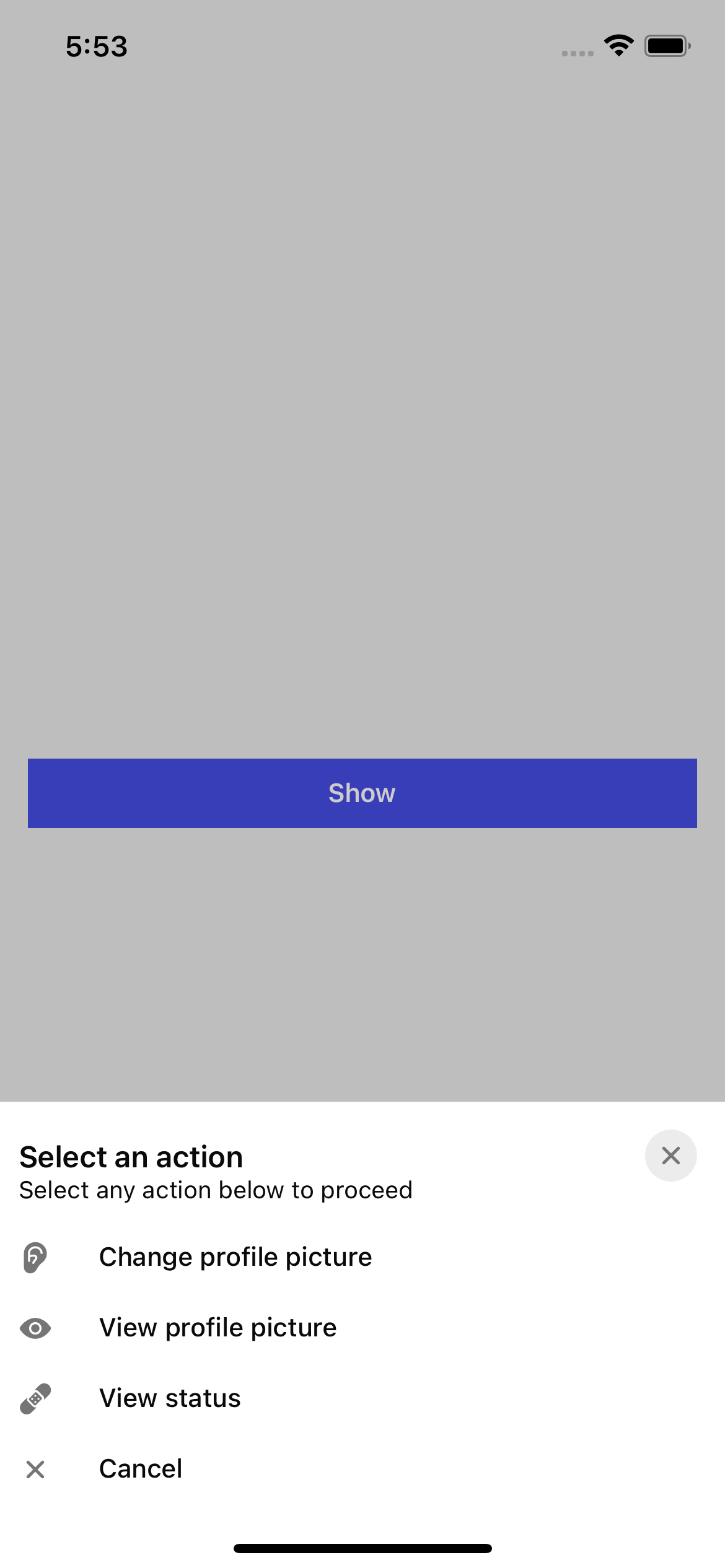
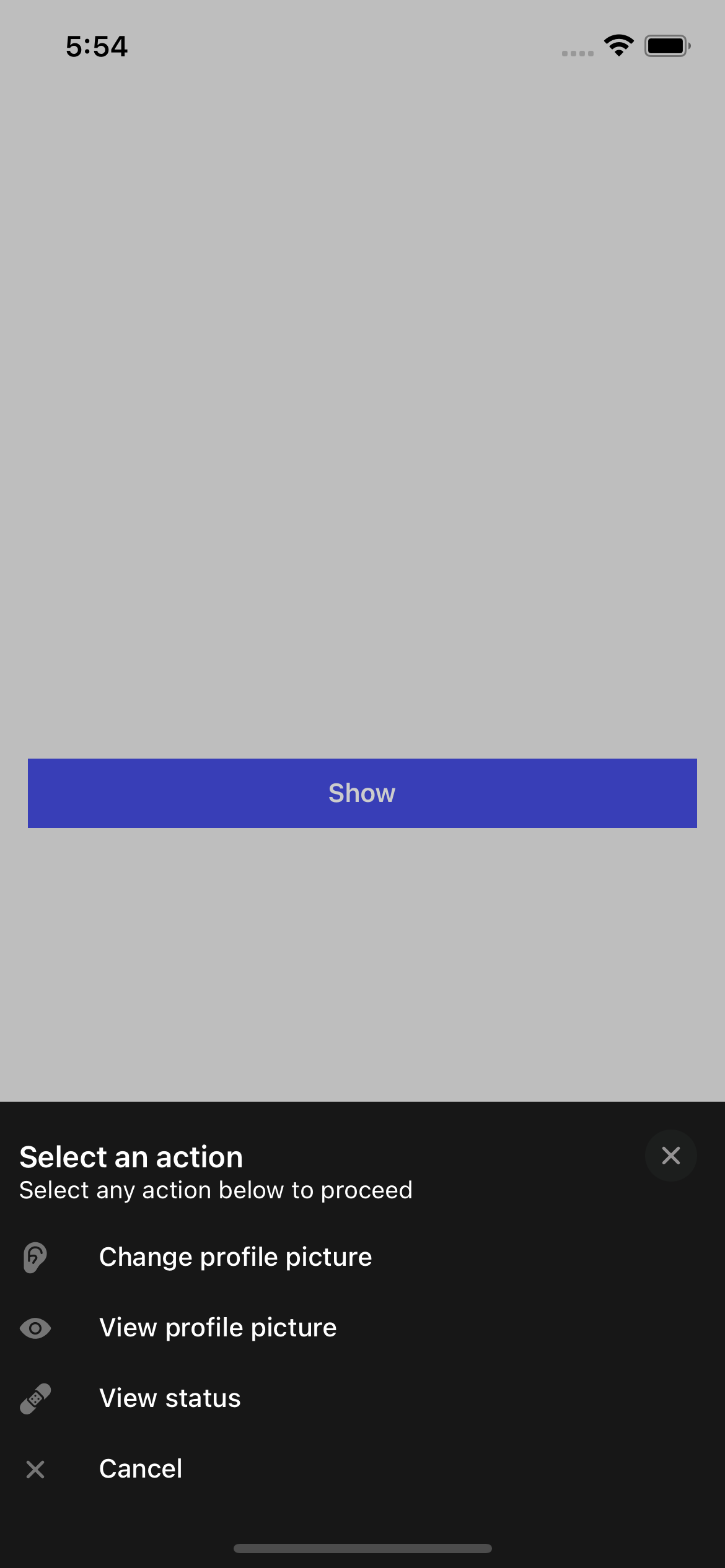
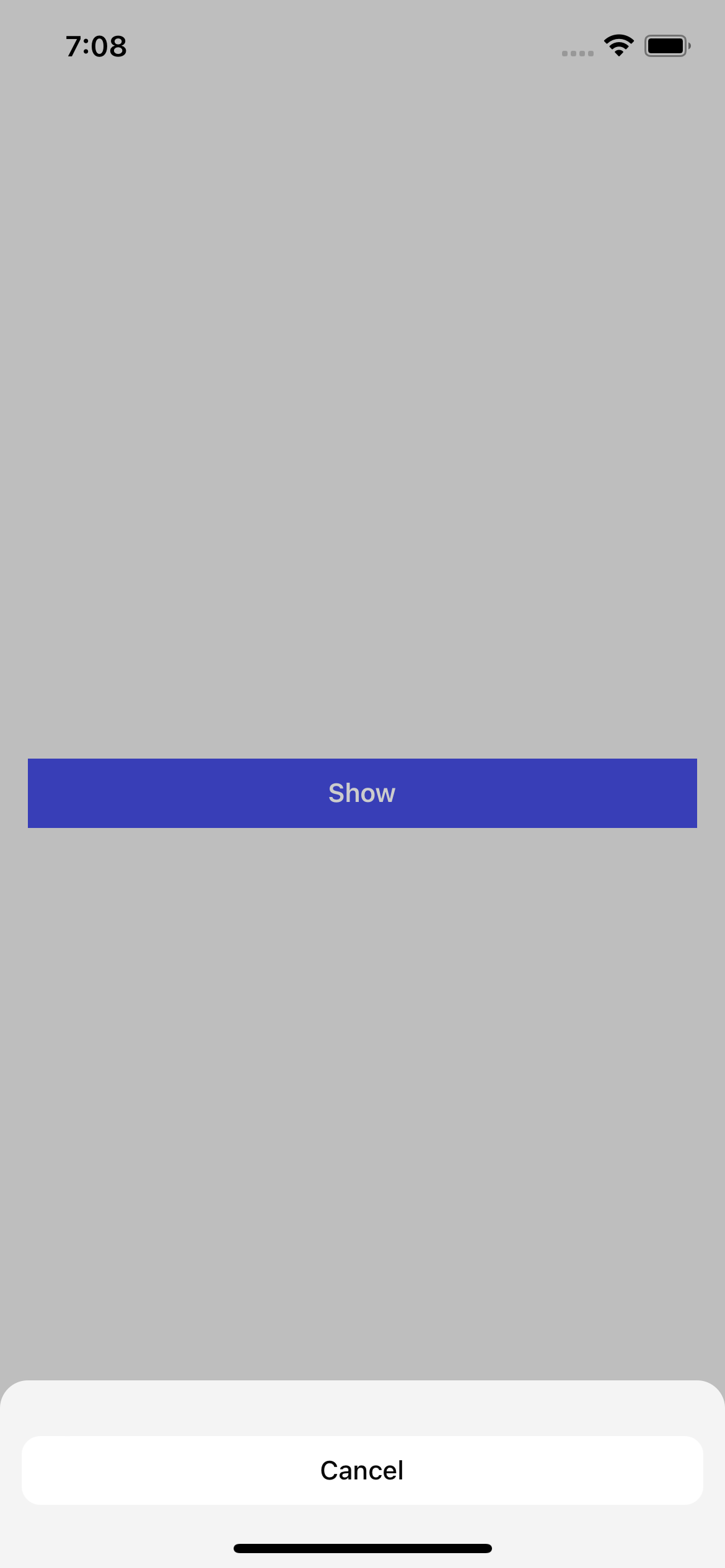
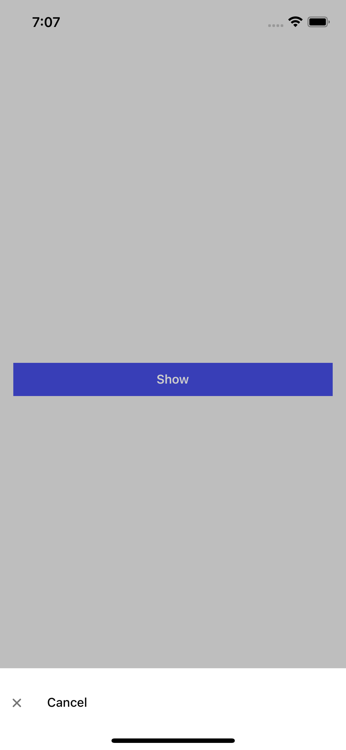
| cancelText | string | NO | Text for cancel button |
| description | string | NO | Description text for your ActionSheet |
| showCancelButton | boolean | NO | Show cancel button |
| showIconOnIos | boolean | NO | Show action icon on iOS |
| showCloseButton | boolean | NO | Show close button |
| theme | ActionSheetTheme | NO | Customize your ActionSheet theme. |
| title | string | NO | Title for your ActionSheet. |
Action props
| Name | Type | Required | Description |
|---|---|---|---|
| text | string | YES | Action button text. |
| icon | string | NO | Icon to show in the action. |
| iconColor | string | NO | Personalized icon color. |
| textStyle | StyleProp<TextStyle> | NO | Personalized styles for your text button. |
| onPress | () => void | YES | Function that is executed when the button is pressed. |
ActionSheetTheme props
| Name | Type | Default iOS | Default Android |
|---|---|---|---|
| appearance | 'light' | 'dark' | System | System |
| backgroundColor | string | Light: '#F4F4F4' Dark: '#171717' | Light: '#FFFFFF' Dark: '#171717' |
| buttonColor | string | Light: '#FFFFFF' Dark: '#242625' | Light: '#FFFFFF' Dark: '#171717' |
| closeBackgroundColor | string | Light: '#ECECEC' Dark: '#1C1E1D' | Light: '#ECECEC' Dark: '#1C1E1D' |
| closeIconColor | string | Light: '#767779' Dark: '#959394' | Light: '#767779' Dark: '#959394' |
| separatorColor | string | Light: '#E4E4E4' Dark: '#343434' | N/A |
| textColor | string | Light: '#0A0A0A' Dark: '#FFFFFF' | Light: '#0A0A0A' Dark: '#FFFFFF' |
| theme | 'cupertino' | 'material' | System | System |
Usage with props
import React, {useState} from 'react';
import {ActionSheet} from 'rn-inkpad';
const MyComponent = () => {
const [isVisible, setIsVisible] = useState(false);
return (
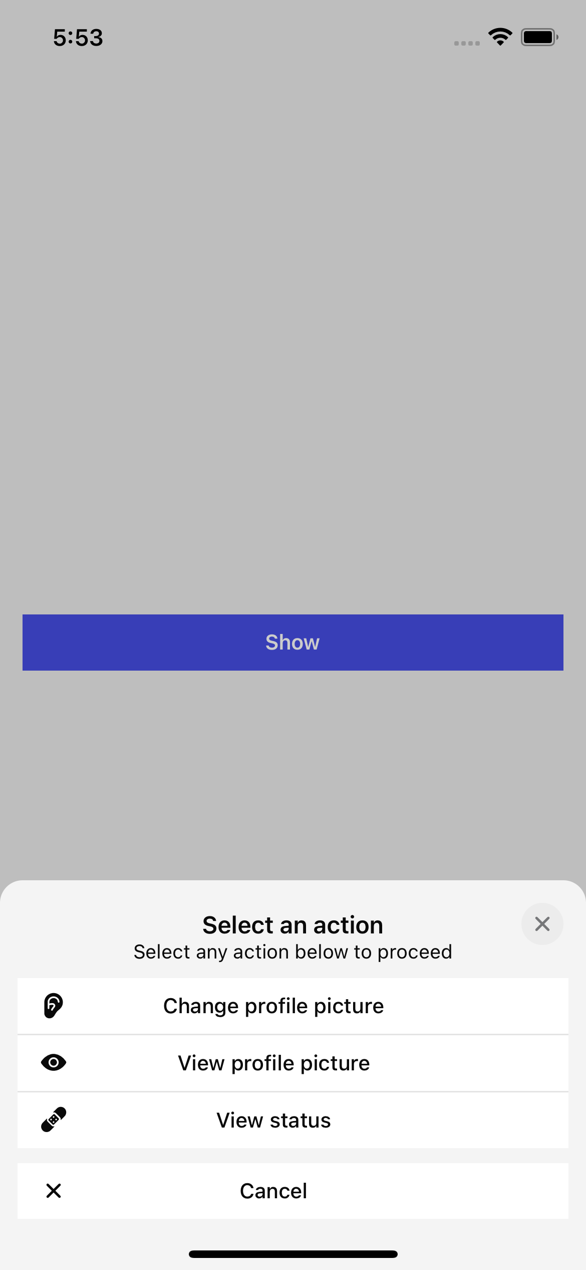
<ActionSheet
actions={[
{
text: 'Change profile picture',
icon: 'ear',
onPress: () => console.log('Change profile picture'),
},
{
text: 'View profile picture',
icon: 'eye',
onPress: () => console.log('View profile picture'),
},
{
text: 'View status',
icon: 'bandage',
onPress: () => console.log('View status'),
},
]}
setVisible={setIsVisible}
description="Select any action below to proceed"
title="Select an action"
visible={isVisible}
/>
);
};
Examples
iOS
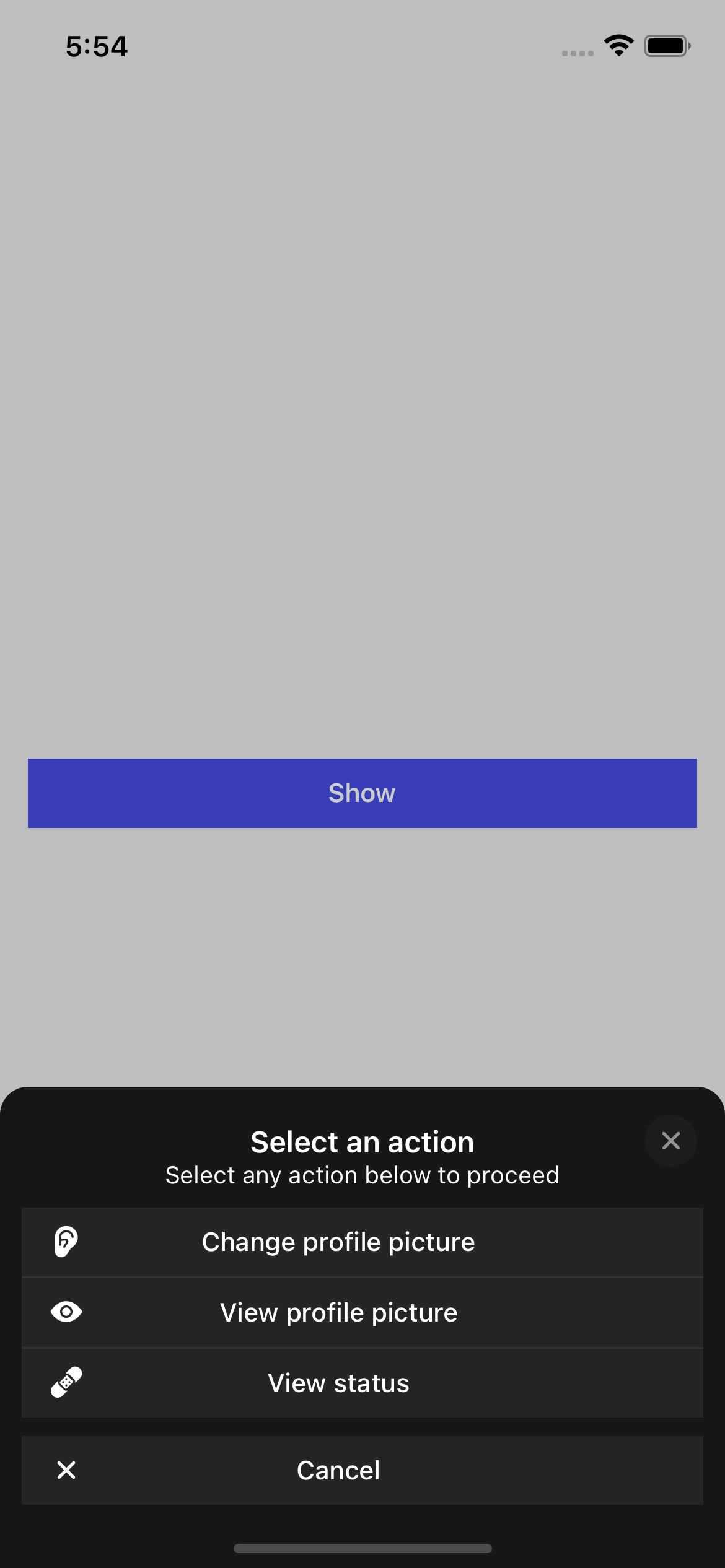
Android