SlideAction
The SlideAction component in our library is an interactive element designed to trigger actions when users perform a sliding gesture.
Usage
Basic usage
import {ProgressBar} from 'rn-inkpad';

const MyComponent = () => {
  return <ProgressBar />;
};

Props
| Name | Type | Default | Description |
|---|---|---|---|
| height | number | 56 | Slider height. |
| icon | string | Thumb icon. | |
| iconColor | string | #F43F5D | Thumb icon color. |
| iconCompletedColor | string | #4ADE80 | Thumb icon color when is completed. |
| iconOnCompleted | string | Thumb icon when is completed. | |
| iconSize | number | 20 | Icon size. |
| isCompleted | boolean | false | Indicates whether the slider is complete or not. |
| padding | number | 8 | Padding between thumb and edges. |
| readonly | boolean | false | Indicates whether the slider is read-only. |
| style | StyleProp<ViewStyle> | Custom styles for your slider container. | |
| text | string | Slider text. | |
| textOnCompleted | string | Slider text when is completed. | |
| textPosition | 'center' | 'ends' | center | Text position. |
| textStyle | StyleProp<TextStyle> | Custom styles for your slider. | |
| thumbBorderColor | string | Thumb border color. | |
| thumbBorderWidth | number | Thumb border width. | |
| thumbColor | string | #FFFFFF | Thumb color. |
| thumbCompletedColor | string | #FFFFFF | Thumb color when is completed. |
| thumbWidth | string | 40 | Thumb width. |
| tintColor | string | #F43F5D | Slider background color. |
| tintCompletedColor | string | #4ADE80 | Slider background color when is completed. |
| onCompleted | () => void | Callback that is called when slide is completed. |
Usage props
import React, {useState} from 'react';
import {StyleSheet, Text, View} from 'react-native';
import {SlideAction} from 'rn-inkpad';
const MyComponent = () => {
const [confirmed, setConfirmed] = useState(false);
return (
<View>
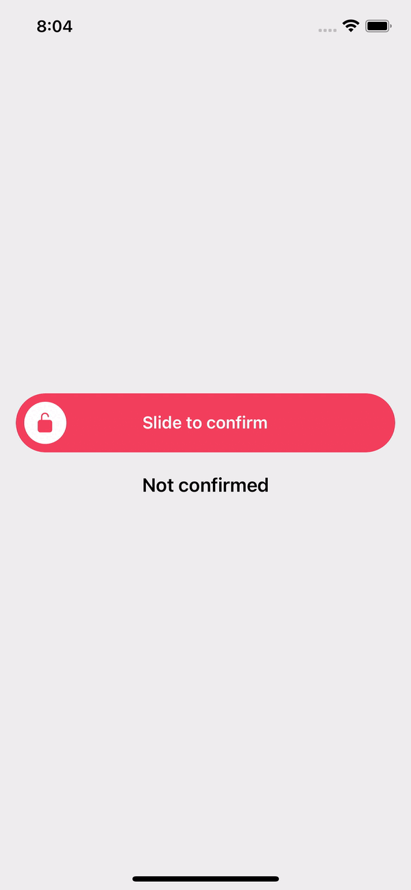
<SlideAction
icon="lock-open"
iconOnCompleted="lock-closed"
text="Slide to confirm"
textOnCompleted="Confirmed"
onCompleted={() => setConfirmed(true)}
/>
<Text style={styles.text}>
{confirmed ? 'Confirmed' : 'Not confirmed'}
</Text>
</View>
);
};
const styles = StyleSheet.create({
text: {
fontSize: 18,
fontWeight: '600',
marginTop: 20,
textAlign: 'center',
},
});
Example with props