SegmentedControl
The SegmentedControl component in our library is a user interface element used to enable users to make selections from a predefined set of options. It typically appears as a horizontal row of segmented buttons, each representing a distinct choice. Users can toggle between segments to indicate their selection preference, with only one segment active at a time. SegmentedControls are commonly used in applications to provide users with a clear and intuitive way to switch between different views, filters, or categories.
Usage
Basic usage
import {SegmentedControl} from 'rn-inkpad';
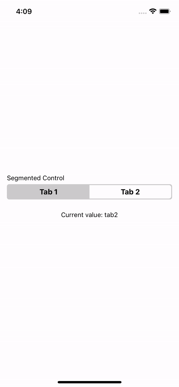
const App = () => {
const [value, setValue] = useState('tab1');
const values = [
{key: 'Tab 1', value: 'tab1'},
{key: 'Tab 2', value: 'tab2'},
];
return (
<SegmentedControl
label="Segmented Control"
values={values}
onChange={value => setValue(value)}
/>
);
};
Props
| Prop | Description | Type | Required | Default |
|---|---|---|---|---|
values | Key and value array to generate each tab. | {key: string; value: string}[] | Yes | None |
onChange | Function that returns the selected value. | (value: string) => void | Yes | None_ |
label | The label with which you want to identify the segmentedControl. | string | No | None |
labelStyle | Styles for label. | StyleProp<TextStyle> | No | None |
selectedIndex | Selected initial value. | number | No | 0 |
backgroundColor | SegmentedControl background color. | string | No | '#CCCCCC' |
tintColor | Tint color for the selected tab. | string | No | '#FFFFFF' |
textColor | Text color in the segmentedControl. | string | No | '#000000' |
selectedTextColor | Text color en the selected tab. | string | No | '#000000' |
style | Styles for the component container. | StyleProp<ViewStyle> | No | None |
Example