TabControl
The TabControl component in our library is a versatile navigational element used to organize and present multiple views or sections within an application. It typically appears as a set of tabs arranged horizontally or vertically, with each tab representing a distinct content area or feature. Users can switch between tabs to access different parts of the application quickly and intuitively. TabControls are commonly used in applications with complex navigation structures, such as settings screens, multi-step processes, or content-rich interfaces.
Usage
Basic usage
import {TabControl} from 'rn-inkpad';
import {FormUser, Users} from './components';
const App = () => {
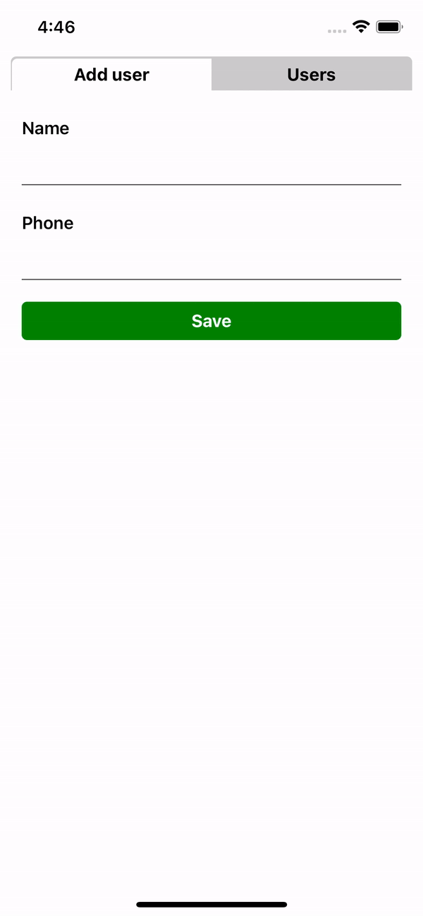
const values = [
{key: 'Add user', renderItem: FormUser},
{key: 'Users', renderItem: Users},
];
return <TabControl values={values} />;
};
Properties
| Prop | Description | Type | Required | Default |
|---|---|---|---|---|
values | Key and renderItem array to generate each tab. | {key: string; renderItem: JSX.Element}[] | Yes | None |
label | The label with which you want to identify the tabControl. | string | No | None |
labelStyle | Styles for label. | StyleProp<TextStyle> | No | None |
selectedIndex | Selected initial value. | number | No | 0 |
backgroundTabColor | TabControl background color. | string | No | '#CCCCCC' |
tabTintColor | Tint color for the selected tab. | string | No | '#FFFFFF' |
textColor | Text color in the TabControl. | string | No | '#000000' |
selectedTextColor | Text color en the selected tab. | string | No | '#000000' |
containerStyle | Styles for the rendered component. | StyleProp<ViewStyle> | No | None |
style | Styles for the component container. | StyleProp<ViewStyle> | No | None |
Example