ProgressBar
The ProgressBar component in our library is a visual element used to indicate the progress of a task or process within an application. It typically appears as a horizontal bar that fills up gradually as the task progresses, providing users with a visual cue of completion status. ProgressBars are commonly used to represent tasks such as file uploads, downloads, form submissions, or loading screens.
Usage
Basic usage
import {ProgressBar} from 'rn-inkpad';

const MyComponent = () => {
  return <ProgressBar />;
};

Props
| Name | Type | Default | Description |
|---|---|---|---|
| backgroundColor | string | #FFFFFF | Bar background color. |
| borderColor | string | Bar boder color. | |
| borderRadius | number | 0 | Round the corners. |
| height | number | 20 | Bar height. |
| progressColor | string | #00CC00 | Progress color. |
| rounded | boolean | false | Round all corners. |
| showPercent | boolean | false | Show or hide progress text. |
| textColor | string | Progress text color. | |
| value | number | 0 | Progress value. |
Usage props
import React, {useState} from 'react';
import {View} from 'react-native';
import {Button, ProgressBar} from 'rn-inkpad';
const MyComponent = () => {
const [value, setValue] = useState(0);
const handlePress = () => {
if (value === 100) {
setValue(0);
} else {
setValue(value + 25);
}
};
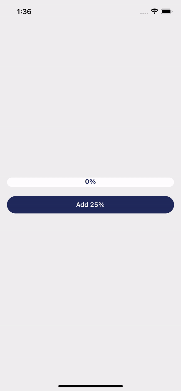
return (
<View>
<ProgressBar
value={value}
rounded
progressColor="#DB504A"
textColor="#21295C"
showPercent
/>
<Button
text={value === 100 ? 'Reset' : 'Add 25%'}
style={{marginTop: 20}}
rounded
buttonColor="#21295C"
onPress={handlePress}
/>
</View>
);
};
Example with props