DrawerNavigation
The DrawerNavigation component in our library is a versatile navigational element commonly used in mobile and web applications to provide users with access to various screens, features, or settings. It typically appears as a side panel that can be swiped in from the edge of the screen or toggled with a menu button. DrawerNavigation organizes app content and functionality into a hierarchical menu structure, allowing users to navigate between different sections or views efficiently. It offers a convenient way to access less frequently used features, settings, or navigation options without cluttering the main interface.
Usage
Basic usage
import {View} from 'react-native';
import {DrawerNavigation} from 'rn-inkpad';
const MyComponent = () => {
return (
<View style={{flex: 1}}>
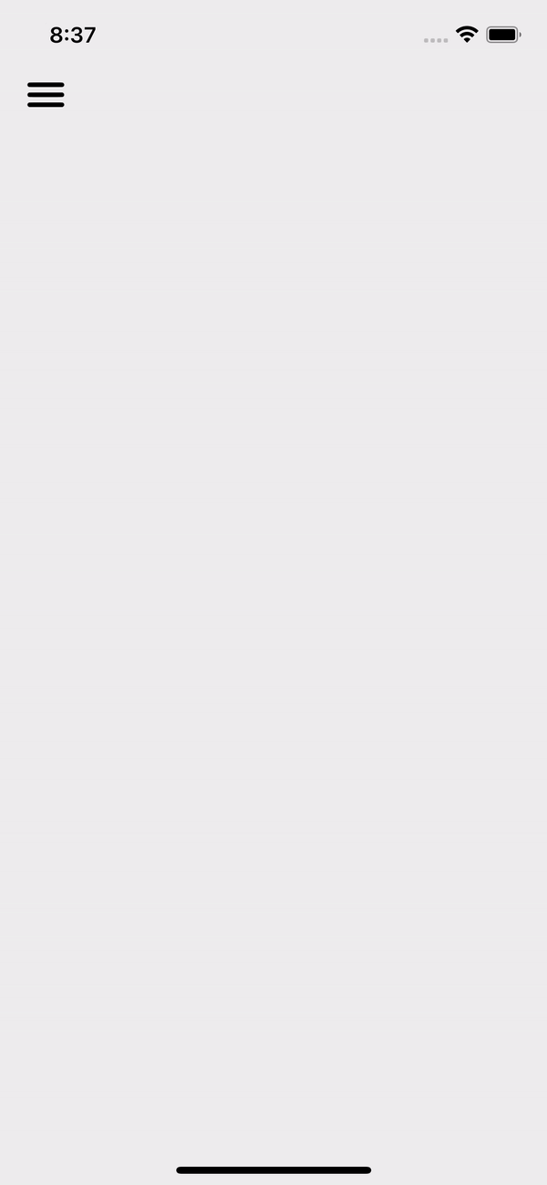
<DrawerNavigation />
</View>
);
};
Props
| Name | Type | Default | Description |
|---|---|---|---|
| backgroundColor | string | #464EE5 | Drawer background color. |
| closeIcon | string | close | Icon to close the drawer. |
| collapseIcon | string | chevron-up | Icon to collapse drawer groups. |
| expandIcon | string | chevron-down | Icon to expand drawer groups |
| fontSize | number | 18 | Drawer item font size. |
| icon | string | menu | Icon to open the drawer. |
| iconColor | string | Drawer icon color. | |
| iconSize | number | 35 | Drawer icon size. |
| iconTop | number | 50 | Gap between top and drawer icon. |
| image | ImageSourcePropType | It is usually the app logo that goes at the top of the drawer. | |
| imageStyles | StyleProp<ImageStyle> | Custom styles for your image. | |
| itemIconSize | number | 19 | Drawer item icon size. |
| items | Item[] | Array of items or group of items in your drawer. | |
| textColor | string | Drawer item text color. | |
| textStyles | StyleProp<TextStyle> | Custom styles for your drawer text item. | |
| widthPercent | number | 65 | Percentage of width that the drawer occupies on the screen. |
Item
In the items array you can send elements of type DrawerItem or DrawerGroup.
If you send a DrawerGroup it will be shown as a dropdown list in the DrawerNavigation.
DrawerGroup props
| Name | Type | Required | Description |
|---|---|---|---|
| icon | string | YES | Item Icon. |
| items | DrawerItem[] | YES | Item dropdown list. |
| text | string | YES | Item text. |
DrawerItem props
| Name | Type | Required | Description |
|---|---|---|---|
| icon | string | YES | Item icon. |
| text | string | YES | Item text. |
| onPress | () => void | NO | Callback that is called when item is pressed. |
This navigation only provides the style for your navigation, however to navigate to different screens you must install a navigation package.
Usage with props
import {View} from 'react-native';

import {BottomTabNavigation} from 'rn-inkpad';

import Logo from './assets/rn-logo.png';

const MyComponent = () => {
  return (
    <View style={{flex: 1}}>
      <DrawerNavigation
        backgroundColor="#BEF0F3"
        image={Logo}
        items={[
          {icon: 'home', text: 'Home', onPress: () => console.log('Home')},
          {
            text: 'User',
            icon: 'person',
            items: [
              {
                icon: 'person',
                text: 'Profile',
                onPress: () => console.log('Profile'),
              },
              {
                icon: 'time',
                text: 'History',
                onPress: () => console.log('History'),
              },
              {
                icon: 'star',
                text: 'Starred',
                onPress: () => console.log('Starred'),
              },
            ],
          },
          {
            icon: 'cog',
            text: 'Settings',
            onPress: () => console.log('Settings'),
          },
        ]}
      />
    </View>
  );
};
Example with props
