BottomTabNavigation
The BottomTabNavigation component in our library is a navigational element typically placed at the bottom of the screen in mobile applications. It provides users with quick access to different sections or views of the app, enhancing navigation efficiency. Each tab represents a specific category or feature, and users can switch between tabs to access different parts of the application seamlessly. BottomTabNavigation promotes intuitive exploration of app content and functionality, offering a consistent and familiar navigation pattern across screens.
Usage
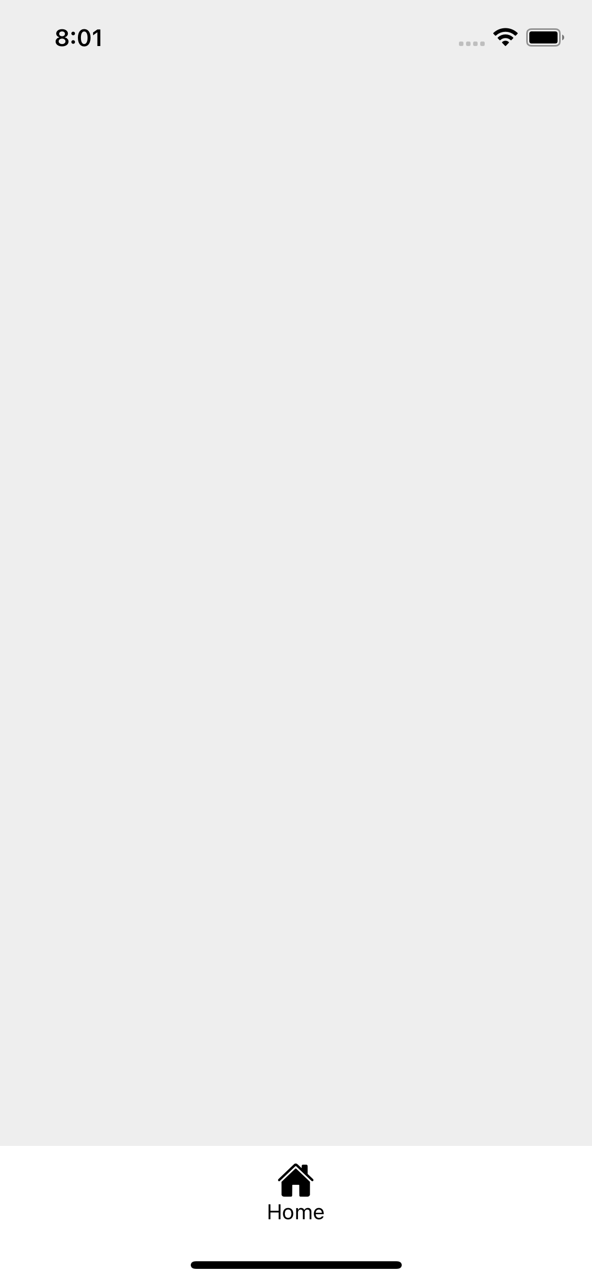
Basic usage
import {View} from 'react-native';

import {BottomTabNavigation} from 'rn-inkpad';

const MyComponent = () => {
  return (
    <View style={{flex: 1}}>
      <BottomTabNavigation />
    </View>
  );
};
Props
| Name | Type | Default | Description |
|---|---|---|---|
| backgroundColor | string | #FFFFFF | Background color. |
| highlightedBgColor | string | #DB504A | Background color of a highlighted element. |
| highlightedIconColor | string | Icon color of a highlighted element. | |
| iconColor | string | Tab icon color. | |
| iconSize | number | 25 | Tab icon size. |
| labelStyle | StyleProp<TextStyle> | Custom styles for labels. | |
| selectedColor | string | #DB504A | Color of the indicator of a selected tab. |
| selectedheight | number | 5 | Height of the indicator of a selected tab. |
| selectedIndex | number | Selected index. | |
| textColor | string | Label color. | |
| values | NavigationItem[] | [{icon: 'home', text: 'Home'}] | Array of each of the tabs. |
NavigationItem props
| Name | Type | Required | Description |
|---|---|---|---|
| highlighted | boolean | NO | Activate element highlighting. |
| icon | string | NO | Tab icon. |
| text | string | NO | Tab label. |
| onPress | () => void | NO | Callback that is called when tab is pressed. |
Information
This navigation only provides the style for your navigation, however to navigate to different screens you must install a navigation package.
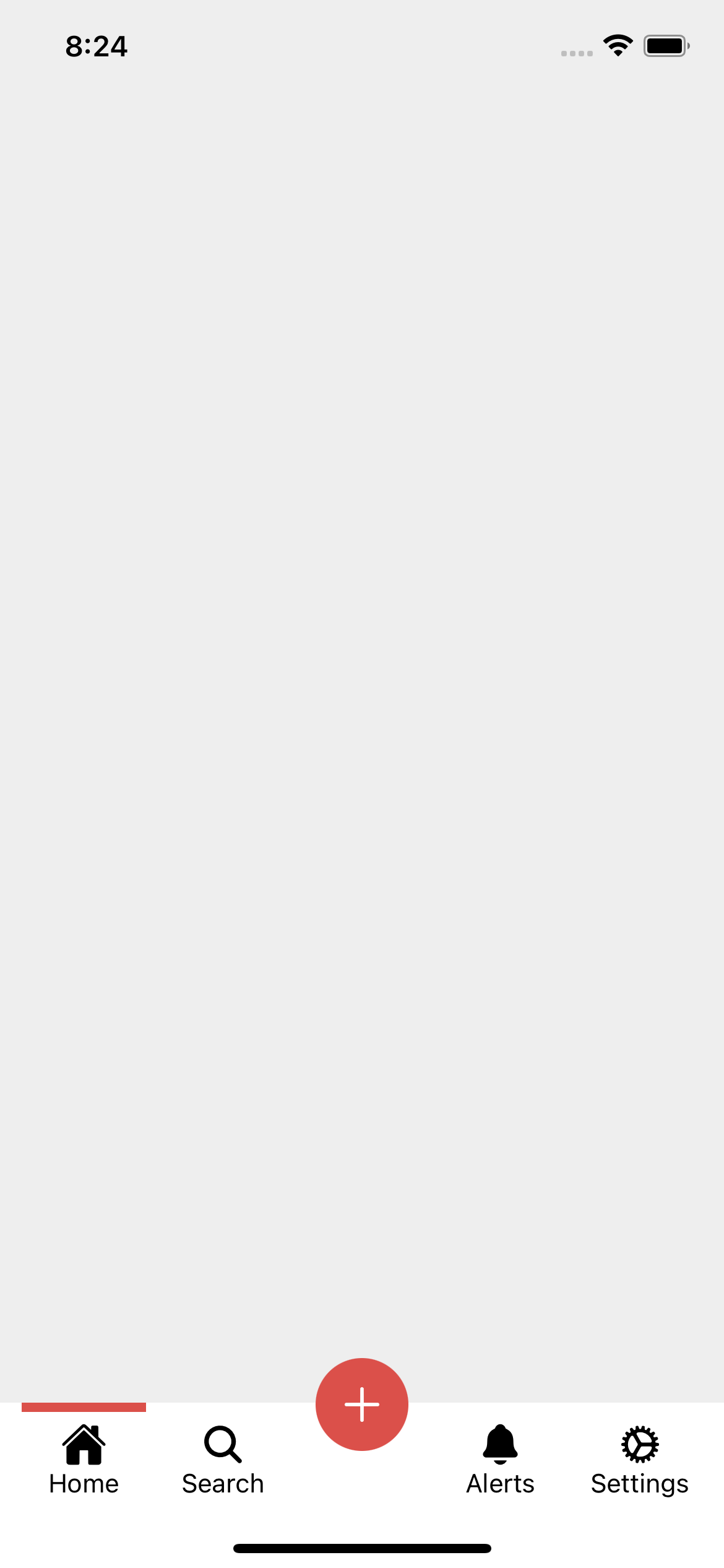
Usage with props
import {View} from 'react-native';

import {BottomTabNavigation} from 'rn-inkpad';

const MyComponent = () => {
  return (
    <View style={{flex: 1}}>
      <BottomTabNavigation
        selectedIndex={0}
        highlightedIconColor="#FFF"
        values={[
          {icon: 'home', text: 'Home', onPress: () => console.log('Home')},
          {
            icon: 'search',
            text: 'Search',
            onPress: () => console.log('Search'),
          },
          {
            icon: 'add',
            text: 'Add',
            highlighted: true,
            onPress: () => console.log('Add'),
          },
          {
            icon: 'notifications',
            text: 'Alerts',
            onPress: () => console.log('Alerts'),
          },
          {
            icon: 'cog',
            text: 'Settings',
            onPress: () => console.log('Settings'),
          },
        ]}
      />
    </View>
  );
};
Example with props