FloatingActionCard
The FloatingActionCard is an innovative component in our library, blending the functionality of a Floating Action Button (FAB) with the versatility of a Card. This component presents a visually engaging card that "floats" above the content, similar to a FAB, while also providing a structured layout for displaying information or actions. FloatingActionCards are ideal for highlighting important content or key actions within an application, combining accessibility with a sleek design aesthetic. With customizable styles and configurations, our FloatingActionCard component enhances user engagement and navigation efficiency in modern app interfaces.
Usage
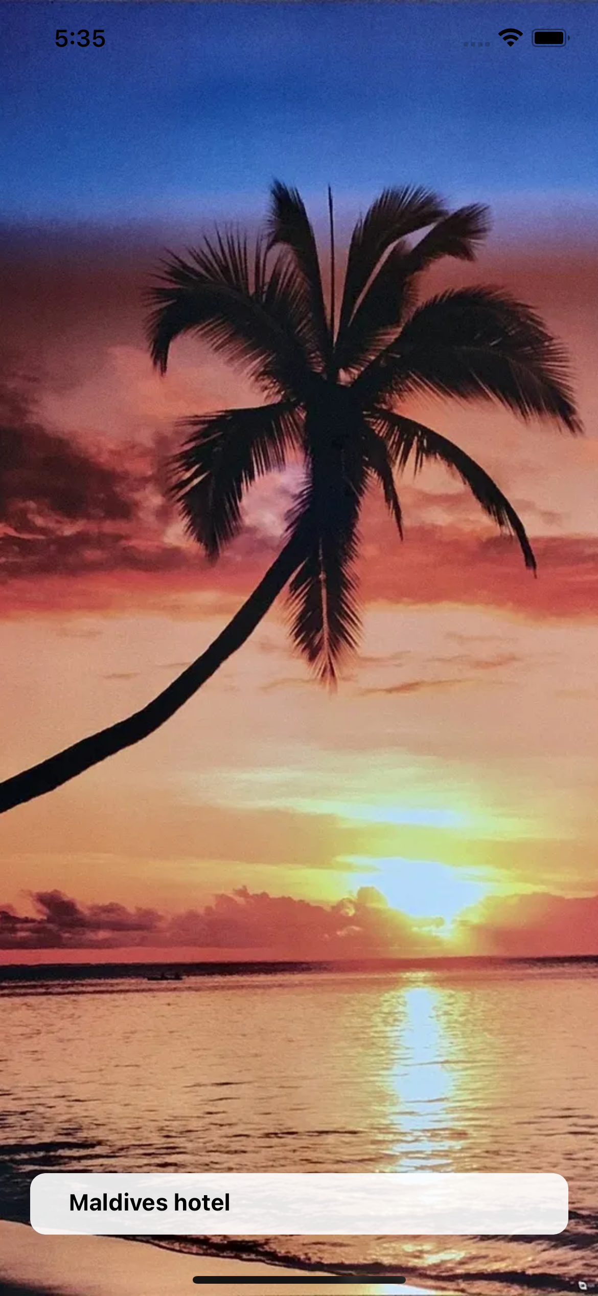
Basic usage
import React from 'react';
import {Image, View} from 'react-native';

import {FloatingActionCard} from 'rn-inkpad';

const MyComponent = () => {
  return (
    <View>
      <Image
        source={{
          uri: 'https://example.com/beach.webp',
        }}
        style={{width: '100%', height: '100%'}}
      />
      <FloatingActionCard title="Maldives hotel" />
    </View>
  );
};
Props
| Name | Type | Default | Description |
|---|---|---|---|
| backgroundColor | RGB | RBGA | HEX | #FFFFFF | Card background color. |
| bottom | number | 40 | Separation between bottom and component. |
| description | string | Extra information. | |
| decimals | number | 1 | Number of decimal places you want to display in the rating. |
| icon | string | Icon that appears next to the rating. | |
| iconColor | string | #FFD700 | Rating icon color. |
| image | ImageSourcePropType | Card image | |
| rating | number | Rating. | |
| textColor | string | Text color. | |
| title | string | Card title. | |
| width | DimensionValue | 90% | Card width. |
| onPress | () => void | Function that is executed when the card is pressed. |
Information
All colors will be converted to RGBA with an opacity of 0.9
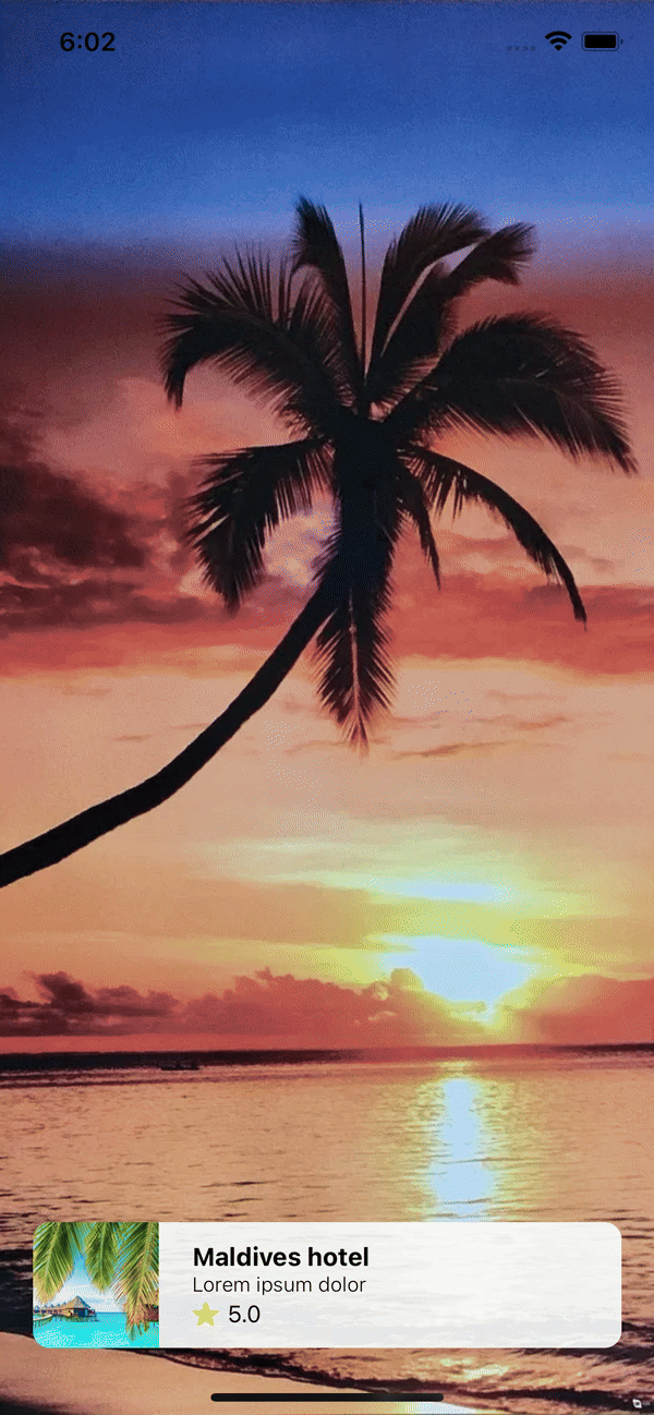
Usage with props
import React, {useState} from 'react';
import {Image, View} from 'react-native';

import {FloatingActionCard} from 'rn-inkpad';

import Image1 from './assets/beach1';
import Image2 from './assets/beach2';

const MyComponent = () => {
  const [secondBackground, setSecondBackground] = useState(false);

  const handleChangeImage = () => {
    setSecondBackground(!secondBackground);
  };

  return (
    <View>
      <Image
        source={{
          uri: secondBackground ? Image2 : Image1,
        }}
        style={{width: '100%', height: '100%'}}
      />
      <FloatingActionCard
        title="Maldives hotel"
        icon="star"
        description="Lorem ipsum dolor"
        image={{
          uri: 'https://www.example.com/photo-beautiful-tropical-maldives-resort-hotel.jpg',
        }}
        rating={5}
        onPress={handleChangeImage}
      />
    </View>
  );
};
Example with props