CardImage
The CardImage component in our library is a specialized element within a card layout designed to prominently display an image as the focal point of the card. This component is ideal for showcasing visual content such as photographs, illustrations, or graphics within a structured card format.
Usage
Basic usage
import React from 'react';
import {CardImage} from 'rn-inkpad';

import Landscape from './assets/landscape.jpeg';

const MyComponent = () => {
  return <CardImage source={Landscape} />;
};
Props
| Name | Type | Required | Description |
|---|---|---|---|
| source | ImageSourcePropType | YES | Image source. |
| loadTime | number | NO | Image loading time. |
| text | string | NO | Description text. |
| theme | Theme | NO | Personalize your card. |
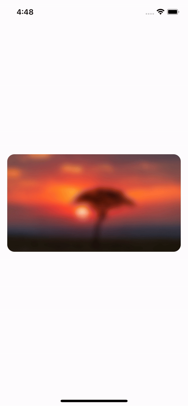
Information
The image starts with a blur effect and decreases as the loading time progresses.
Note
If you don't want that effect, you can submit a load time of 0 milliseconds.
Theme props
| Name | Type | Default | Description |
|---|---|---|---|
| backgroundColor | string | Card background color. | |
| fontSize | number | Text information font size. | |
| fontColor | string | Text information color. | |
| fontWeight | string | Font weight. | |
| radius | number | 15 | Border radius. |
| shadow | boolean | Turn shadow on or off. |
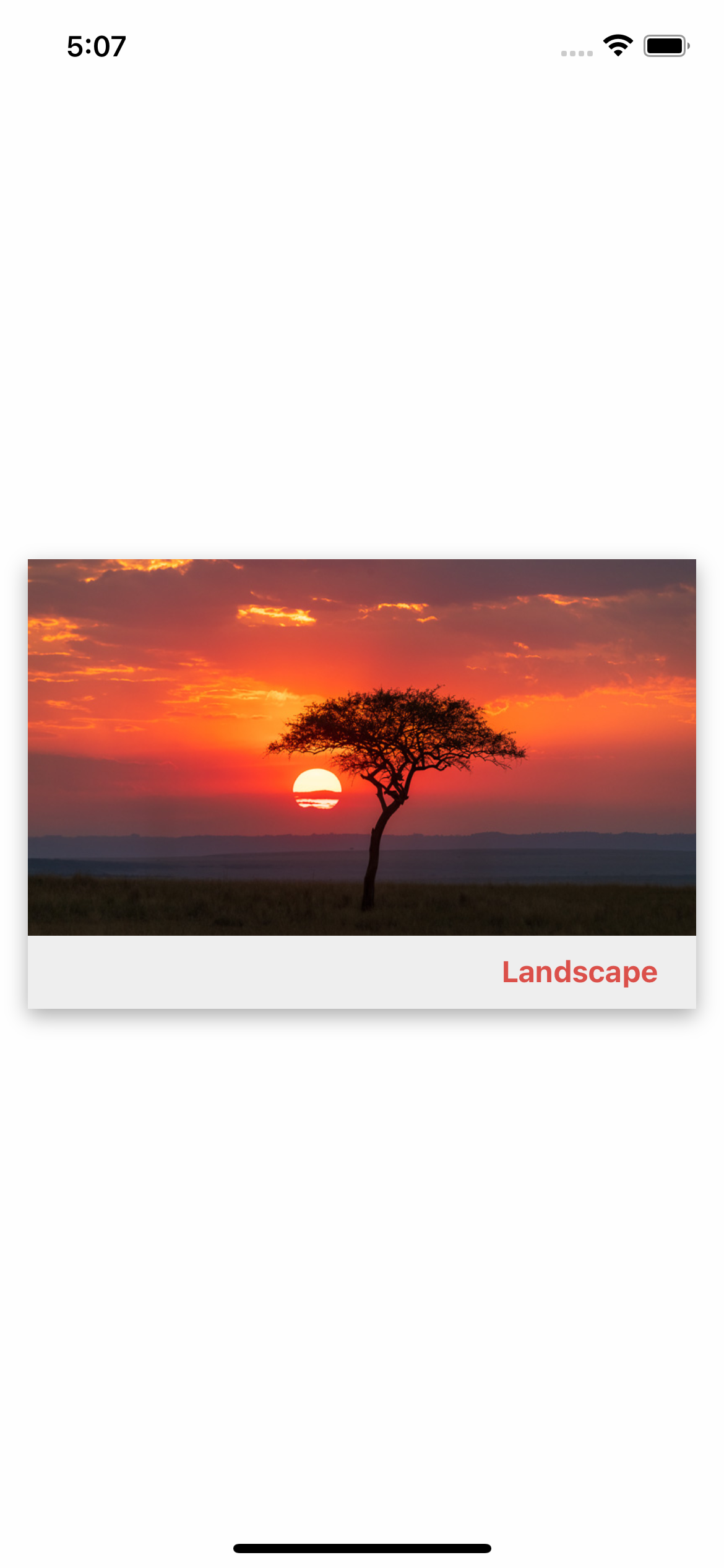
Personalized theme usage
import React from 'react';
import {CardImage} from 'rn-inkpad';

import Landscape from './assets/landscape.jpeg';

const MyComponent = () => {
  return (
    <CardImage
      source={Landscape}
      text="Landscape"
      loadTime={0}
      theme={{
        backgroundColor: '#EEEEEE',
        fontSize: 16,
        fontColor: '#DB504A',
        fontWeight: '700',
        shadow: true,
        radius: 0,
      }}
    />
  );
};
Example with personalized theme