Card
The Card component in our library is a versatile container designed to present content in a visually appealing and structured manner. Cards typically feature a combination of text, icon, and buttons.
Usage
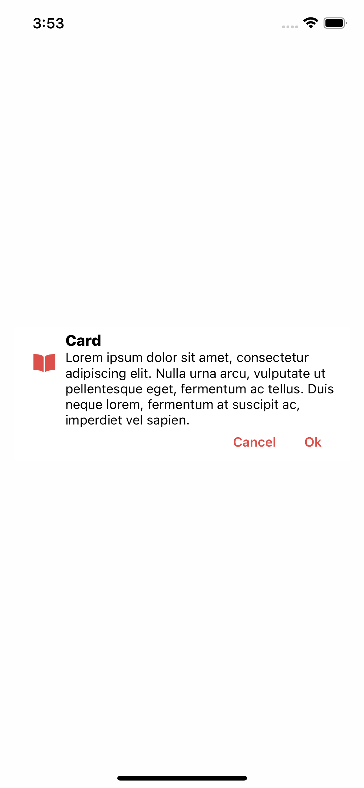
Basic usage
import React from 'react';
import {Card} from 'rn-inkpad';

const MyComponent = () => {
  return (
    <Card
      buttons={[
        {text: 'Cancel', onPress: () => {}},
        {text: 'Ok', onPress: () => {}},
      ]}
      description={
        'Lorem ipsum dolor sit amet, consectetur adipiscing elit. Nulla urna arcu, vulputate ut pellentesque eget, fermentum ac tellus. Duis neque lorem, fermentum at suscipit ac, imperdiet vel sapien.'
      }
      icon={'book-sharp'}
      title={'Card'}
      theme={{
        themeColor: '#DB504A',
      }}
    />
  );
};
Props
| Name | Type | Required | Description |
|---|---|---|---|
| buttons | Button[] | YES | Buttons that appear at the bottom of the card. |
| description | string | YES | Description text. |
| icon | string | YES | Card icon. |
| title | string | YES | Title text. |
| theme | Theme | NO | Personalize your card. |
Button props
| Name | Type | Required | Description |
|---|---|---|---|
| text | string | YES | Button text. |
| onPress | () => void | NO | Function that is executed when the button is pressed. |
Theme props
| Name | Type | Default | Description |
|---|---|---|---|
| backgroundColor | string | Background color. | |
| iconSize | number | 25 | Card icon size. |
| themeColor | string | Icon and buttons color. | |
| titleColor | string | Title color. | |
| titleSize | number | 16 | Title font size. |
| shadow | boolean | false | Turn shadow on or off. |
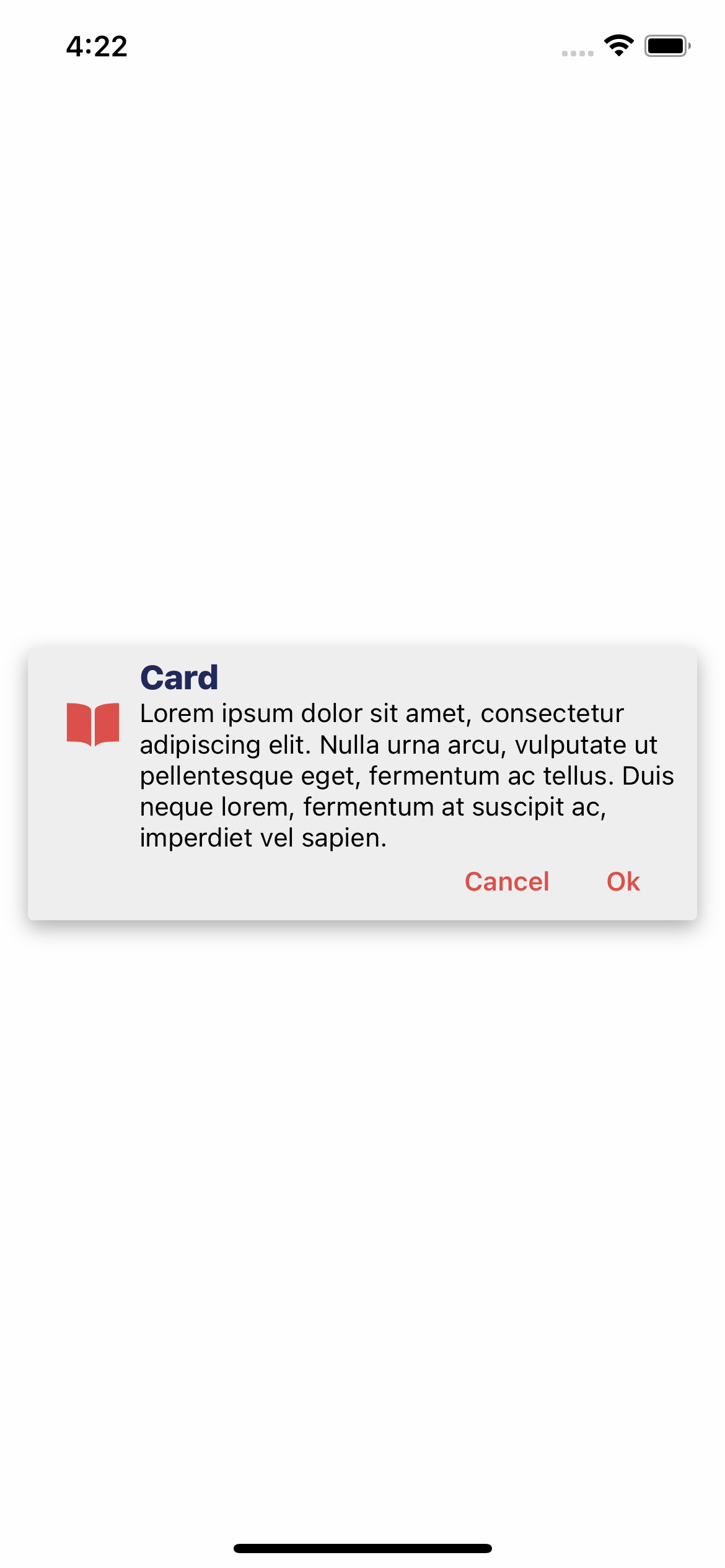
Personalized theme usage
import React from 'react';

import {Card} from 'rn-inkpad';

const MyComponent = () => {
  return (
    <Card
      buttons={[
        {text: 'Cancel', onPress: () => {}},
        {text: 'Ok', onPress: () => {}},
      ]}
      description={
        'Lorem ipsum dolor sit amet, consectetur adipiscing elit. Nulla urna arcu, vulputate ut pellentesque eget, fermentum ac tellus. Duis neque lorem, fermentum at suscipit ac, imperdiet vel sapien.'
      }
      icon={'book-sharp'}
      title={'Card'}
      theme={{
        backgroundColor: '#EEE',
        iconSize: 30,
        themeColor: '#DB504A',
        titleColor: '#21295C',
        titleSize: 18,
        shadow: true,
      }}
    />
  );
};
Personalized theme example