RadioButtons
RadioButtons are essential elements in our library, facilitating user input in selection scenarios where users can choose only one option from a list. When one RadioButton is selected, any previously selected RadioButton in the same group becomes deselected automatically, ensuring mutual exclusivity.
Usage
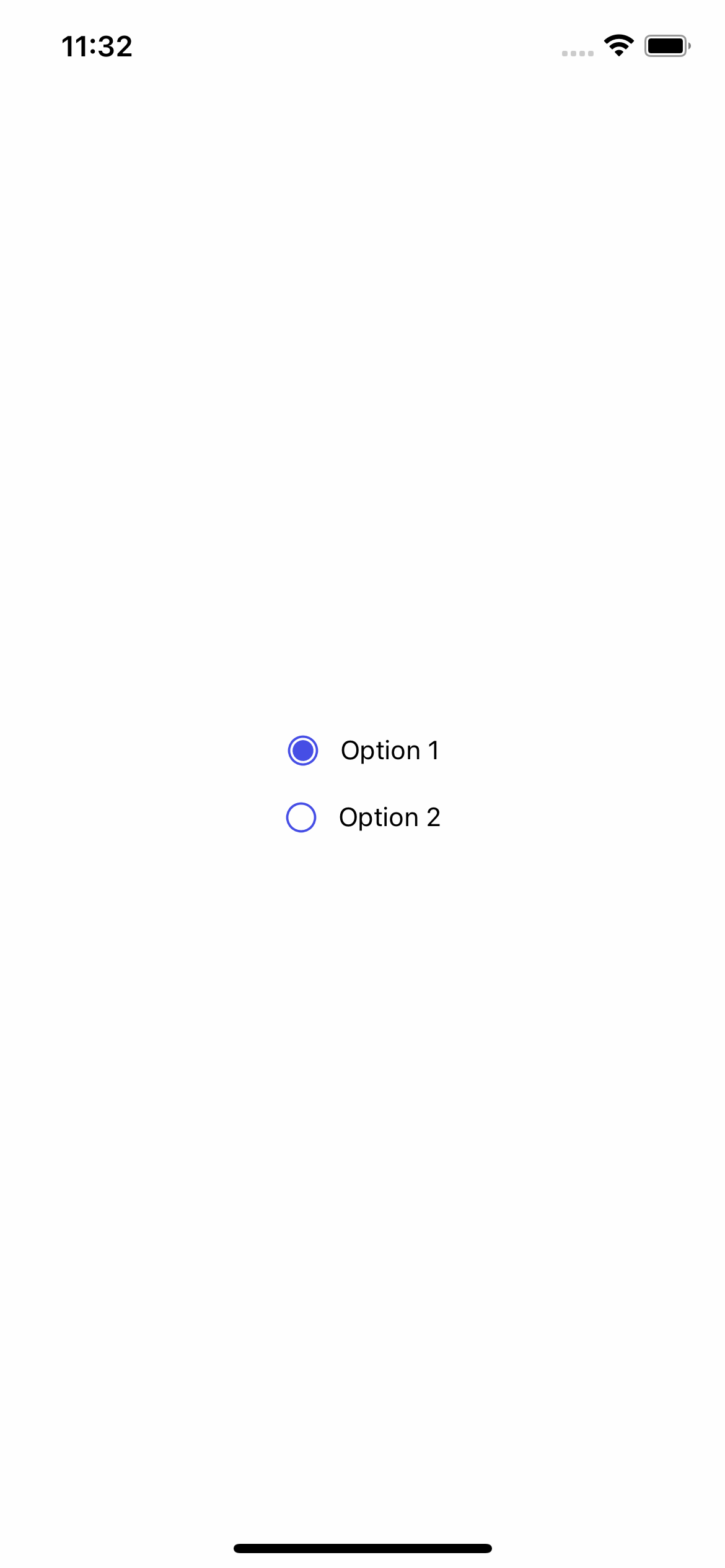
Basic usage
import {RadioButtons} from 'rn-inkpad';

const MyComponent = () => {
  return (
    <RadioButtons
      values={[
        {text: 'Option 1', value: 1},
        {text: 'Option 2', value: 2},
      ]}
    />
  );
};
Props
| Name | Type | Default | Description |
|---|---|---|---|
| values | RadioValue[] | Radio buttons list. | |
| border | boolean | Add border. | |
| borderColor | string | #464EE5 | Border color. |
| defaultChecked | number | Default selected value index. | |
| disabled | boolean | Turn pressable on or off. | |
| fullWidth | boolean | Active full width. | |
| gap | number | Gap between text and icon when vertical orientation is selected. | |
| gapHorizontal | number | 10 | Gap between text and icon when horizontal orientation is selected. |
| iconColor | string | #464EE5 | Icon color. |
| iconPosition | 'left' | 'bottom' | 'top' | 'right' | Icon position. | |
| iconSize | number | 20 | Radio icon size. |
| marginVertical | DimensionValue | 8 | Margin between radio buttons and other components. |
| orientation | 'horizontal' | 'vertical' | vertical | Radio buttons orientation. |
| style | StyleProp<ViewStyle> | Personalized styles for your radio buttons component. | |
| textColor | string | Text color. | |
| textStyle | StyleProp<TextStyle> | Personalized styles for your text button. | |
| onChange | (value: string | number) => void | Function that change selected value. |
RadioValue props
| Name | Type | Required | Description |
|---|---|---|---|
| text | string | NO | Information text |
| value | string | YES | Option value. |
Information
If you do not send text, value will appear as default text.
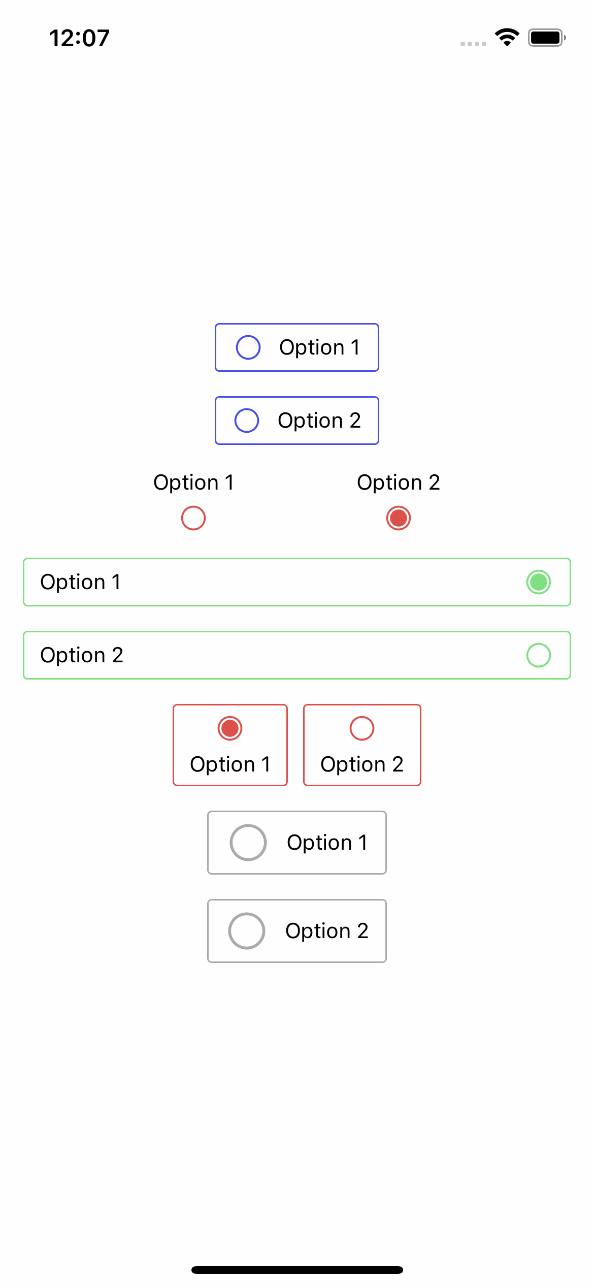
Usage with props
import React from 'react';
import {View, StyleSheet} from 'react-native';

import {RadioButtons} from 'rn-inkpad';

const MyComponent = () => {
  return (
    <View style={styles.container}>
      <RadioButtons
        border
        onChange={value => console.log(value)}
        values={[
          {text: 'Option 1', value: 1},
          {text: 'Option 2', value: 2},
        ]}
      />
      <RadioButtons
        defaultChecked={1}
        gapHorizontal={80}
        iconColor="#DB504A"
        iconPosition="bottom"
        onChange={value => console.log(value)}
        orientation="horizontal"
        values={[
          {text: 'Option 1', value: 1},
          {text: 'Option 2', value: 2},
        ]}
      />
      <RadioButtons
        iconPosition="right"
        defaultChecked={0}
        fullWidth
        iconColor="#7EE081"
        borderColor="#7EE081"
        border
        onChange={value => console.log(value)}
        values={[
          {text: 'Option 1', value: 1},
          {text: 'Option 2', value: 2},
        ]}
      />
      <RadioButtons
        iconPosition="top"
        orientation="horizontal"
        defaultChecked={0}
        border
        borderColor="#DB504A"
        iconColor="#DB504A"
        onChange={value => console.log(value)}
        values={[
          {text: 'Option 1', value: 1},
          {text: 'Option 2', value: 2},
        ]}
      />
      <RadioButtons
        disabled
        border
        iconSize={30}
        values={[
          {text: 'Option 1', value: 1},
          {text: 'Option 2', value: 2},
        ]}
      />
    </View>
  );
};

const styles = StyleSheet.create({
  container: {
    alignItems: 'center',
    flex: 1,
    justifyContent: 'center',
  },
});
Example with props