LongPressButton
El LongPressButton es un componente interactivo de nuestra biblioteca que desencadena acciones cuando se mantiene pulsado durante un tiempo determinado, normalmente más largo que la pulsación de un botón estándar.
Uso
Uso básico
import {LongPressButton} from 'rn-inkpad';
const MyComponent = () => {
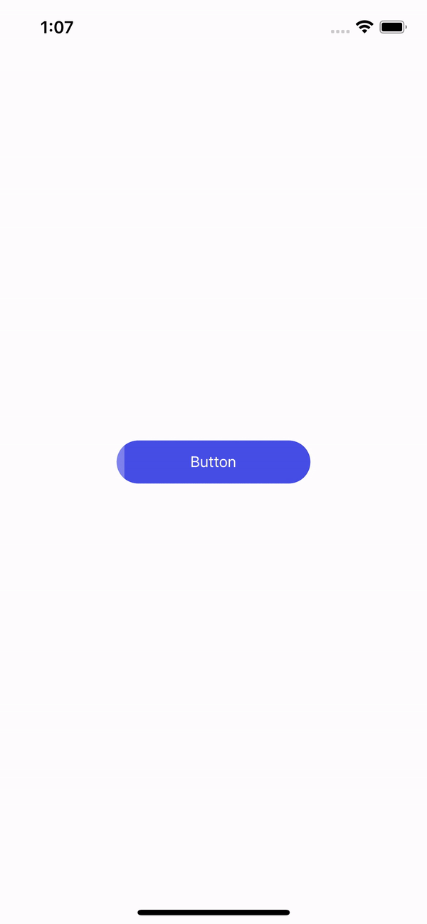
return <LongPressButton />;
};
Props
| Nombre | Tipo | Predeterminado | Descripción |
|---|---|---|---|
| backgroundColor | string | #464EE5 | Color de fondo del botón. |
| behavior | 'left-to-right' | 'right-to-left' | 'center-to-ends' | left-to-right | Dirección de movimiento de la barra. |
| borderRadius | number | 20 | Borde redondeado. |
| fontSize | number | Tamaño de la fuente. | |
| fullWidth | boolean | Activa ancho completo. | |
| height | DimensionValue | 40 | Altura del botón. |
| icon | string | Icono del botón. | |
| iconPosition | 'left' | 'right' | left | Posición del icono. |
| longPressTime | number | 2000 | Tiempo en ms requerido para ejecutar la función. |
| progressColor | string | rgba(255, 255, 255, 0.3) | Color del indicador. |
| style | StyleProp<ViewStyle> | Estilos personalizados para el botón. | |
| text | string | Button | Texto del botón. |
| textColor | string | #FFFFFF | Color del texto. |
| width | DimensionValue | 50% | Ancho del botón. |
| onFinish | () => void | Función que se ejecuta al finalizar la pulsación larga. |
Uso con props
import React, {useState} from 'react';
import {View, StyleSheet} from 'react-native';
import {LongPressButton} from 'rn-inkpad';
const MyComponent = () => {
const [isExecuted, setIsExecuted] = useState(false);
const handlePress = () => {
setIsExecuted(true);
setTimeout(() => {
setIsExecuted(false);
}, 1500);
};
return (
<View style={styles.container}>
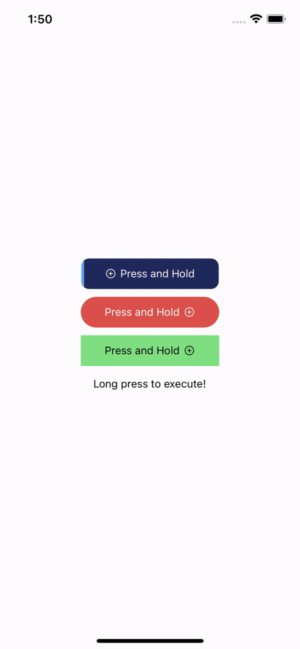
<LongPressButton
backgroundColor="#21295C"
borderRadius={10}
icon="add-circle-outline"
progressColor="#60a5fa"
text="Press and Hold"
onFinish={handlePress}
/>
<LongPressButton
backgroundColor="#DB504A"
behavior="center-to-ends"
icon="add-circle-outline"
iconPosition="right"
progressColor="rgba(0,0,0,0.5)"
style={{marginTop: 10}}
text="Press and Hold"
onFinish={handlePress}
/>
<LongPressButton
backgroundColor="#7EE081"
behavior="right-to-left"
borderRadius={0}
icon="add-circle-outline"
iconPosition="right"
progressColor="#C3F3C0"
style={{marginTop: 10}}
text="Press and Hold"
textColor="#000"
onFinish={handlePress}
/>
<Text style={{marginTop: 15}}>
{isExecuted ? 'Executed' : 'Long press to execute!'}
</Text>
</View>
);
};
const styles = StyleSheet.create({
container: {
alignItems: 'center',
flex: 1,
justifyContent: 'center',
},
});
Ejemplo con props